You Are Browsing The Web Design Category

The Future of Mobile Search

August 29 2016 // SEO + Technology + Web Design // 17 Comments

What if I told you that the future of mobile search was swiping.

Google Mobile Search Tinderized

I don’t mean that there will be a few carousels of content. Instead I mean that all of the content will be displayed in a horizontal swiping interface. You wouldn’t click on a search result, you’d simply swipe from one result to the next.

This might sound farfetched but there’s growing evidence this might be Google’s end game. The Tinderization of mobile search could be right around the corner.

Horizontal Interface

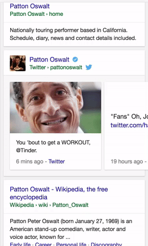
Google has been playing with horizontal interfaces on mobile search for some time now. You can find it under certain Twitter profiles.

Google Twitter Carousel

There’s one for videos.

Google Video Carousel

And another for recipes.

Google Recipe Carousel

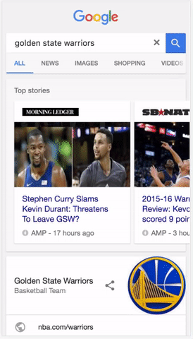
There are plenty of other examples. But the most important one is the one for AMP.

Google AMP Carousel

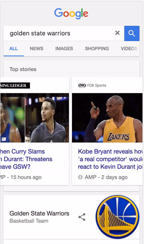
The reason the AMP example is so important is that AMP is no longer going to be served just in a carousel but will be available to any organic search result.

But you have to wonder how Google will deliver this type of AMP carousel interface with AMP content sprinkled throughout the results. (They already reference the interface as the ‘AMP viewer’.)

What if you could simply swipe between AMP results? The current interface lets you do this already.

Google AMP Swipe Interface

Once AMP is sprinkled all through the results wouldn’t it be easier to swipe between AMP results once you were in that environment? They already have the dots navigation element to indicate where you are in the order of results.

I know, I know, you’re thinking about how bad this could be for non-AMP content but let me tell you a secret. Users won’t care and neither will Google.

User experience trumps publisher whining every single time.

In the end, instead of creating a carousel for the links, Google can create a carousel for the content itself.

AMP

Accelerated Mobile Pages Project

For those of you who aren’t hip to acronyms, AMP stands for Accelerated Mobile Pages. It’s an initiative by Google to create near instantaneous availability of content on mobile.

The way they accomplish this is by having publishers create very lightweight pages and then cacheing them on Google servers. So when you click on one of those AMP results you’re essentially getting the cached version of the page direct from Google.

The AMP initiative is all about speed. If the mobile web is faster it helps with Google’s (not so) evil plan. It also has an interesting … side effect.

Google could host the mobile Internet.

That’s both amazing and a bit terrifying. When every piece of content in a search result is an AMP page Google can essentially host that mobile result in its entirety.

At first AMP was just for news content but as of today Google is looking to create AMP content for everything including e-commerce. So the idea of an all AMP interface doesn’t seem out of the question.

Swipes Not Clicks


Swipes Not Clicks

Why make users click if every search result is an AMP page? Seriously. Think about it.

Google is obsessed with reducing the time to long click, the amount of time it takes to get users to a satisfactory result. What better way to do this than to remove the friction of clicking back and forth to each site.

No more blue links.

Why make users click when you can display that content immediately? Google has it! Then users can simply swipe to the next result, and the next, and the next and the next. They can even go back and forth in this way until they find a result they wish to delve into further.

Swiping through content would be a radical departure from the traditional search interface but it would be vastly faster and more convenient.

This would work with the numerous other elements that bubble information up further in the search process such as Knowledge Panels and Oneboxes. Dr. Pete Meyers showed how some of these ‘cards’ could fit together. But the cards would work equally as well in a swiping environment.

How much better would it be to search for a product and swipe through the offerings of those appearing in search results?

New Metrics of Success

Turn It On Its Head

If this is where the mobile web is headed then the game will completely change. Success won’t be tied nearly as much to rank. When you remove the friction of clicking the number of ‘views’ each result gets will be much higher.

The normal top heavy click distribution will disappear to be replaced with a more even ‘view’ distribution of the top 3-5 results. I’m assuming most users will swipe at least three times if not more but that there will be a severe drop off after that.

When a user swipes to your result you’ll still get credit for a visit by implementing Google Analytics or another analytics package correctly. But users aren’t really on your site at that point. It’s only when they click through on that AMP result that they wind up in your mobile web environment.

So the new metric for mobile search success might be getting users to stop on your result and, optimally, click-through to your site. That’s right, engagement could be the most important metric. Doesn’t that essentially create alignment between users, Google and publishers?

Funny thing is, Google just launched the ability to do A/B testing for AMP pages. They’re already thinking about how important it’s going to be to help publishers optimize for engagement.

Hype or Reality?

Is this real or is this fantasy?

Google, as a mobile first company, is pushing hard to reduce the distance between search and information. I don’t think this is a controversial statement. The question is how far Google is willing to go to shorten that distance.

I’m putting a bunch of pieces together here, from horizontal interfaces, to AMP to Google’s obsession with speed to come up with this forward looking vision of mobile search.

I think it’s in the realm of possibility, particularly since the growth areas for Google are in countries outside of the US where mobile is vastly more dominant and where speed can sometimes be a challenge.

TL;DR

When every search result is an AMP page there’s little reason for users to click on a result to see that content. Should Google’s AMP project succeed, the future of mobile search could very well be swiping through content and the death of the blue link.

Readability and SEO

August 13 2012 // SEO + Web Design // 100 Comments

Content marketing is the hot new thing in the wake of Google’s animal themed algorithm updates. Marketers are doubling down on content. Yet, the majority of content on the web is not optimized for readability.

It’s not just what you say, it’s how you present it.

What Is Readability?

There are a lot of definitions of readability, some of which stir up a fair amount of debate. My version is aligned with Steve Krug’s Don’t Make Me Think, Giles Colborne’s Simple and Usable, the legacy of David Ogilvy and the research of Jakob Nielsen.

Readability is about making your content accessible and comfortable. Never make it a chore.

Readability Improves SEO

hey girl I like your blog posts

If you make your content difficult to read the value of that content goes down. Lack of readability frustrates comprehension and reduces sharing. This, in turn, limits the social echo of your content and lowers the chances of it obtaining organic links.

In short, readability is a valuable but overlooked part of SEO. Here’s my guide to producing readable content.

People Don’t Read, They Scan

The first thing you have to come to grips with is that people are not reading every word. Study after study after study shows that people scan instead of read.

On the average Web page, users have time to read at most 28% of the words during an average visit; 20% is more likely.

That doesn’t mean you should skimp on good writing. Instead, you just need to structure your content with scanning in mind.

Use A Font Hierarchy

First You Looked Here, Then Here

One of the better ways to meet that scanning behavior is to use a font hierarchy. Too often I see people using the same font size for their subheads, thinking that a simple bold is going to make the difference. It doesn’t.

If you look back through this blog you’ll see how I figured this out over time. Older posts don’t use a proper font hierarchy and that makes them more difficult to read.

There are some guidelines on the proper ratio for your font hierarchy, but there are so many variables, from the font you’re using to the length of the piece to name just a few. My advice is to use five foot web design to make sure you can read your subheads from a distance. Sometimes I just read my subheads to see if they tell enough of the story by themselves.

I’ve settled on using 14px for body text with a 24px subhead and always want the subheads to be in one line.

Subheads Are Your Friends

The key is to allow people to see the sections of your post at a glance. Make your subheads large enough and descriptive enough so readers can determine whether they’ll actually take the time to read that section word for word.

Use subheads as an advertisement to that section of content.

Subheads are also a great way to logically outline your content. What are the different points and aspects of the topic you’re covering? Most of my blog posts (including this one) start as an outline, which is an asset to creating content that communicates and engages.

Legibility Matters

Using Impact As Body Text Font

Of course you need to use a font face that is legible. Above, I’ve used Chrome’s Developer Tools to change the font on a recent Google blog post to Impact instead of Arial. Impact works on LOLcats when it’s large white text with a black border on a photo background, but using Impact as your body text font? LOL!

There’s a interesting study that shows that the ability to retain information improves when you use unusual fonts. The problem is that people would abandon that content altogether if they weren’t in a controlled setting.

I like (and use) a nice san serif font like Helvetica. But don’t get hung up on the serif versus san serif argument. Research conducted by Alex Poole indicates that it’s likely a matter of personal preference.

So if you like Georgia or Times New Roman, go for it. Sure, there have been some studies that show different fonts produce different reading speeds, but I wouldn’t obsess over it.

Get Line Height Just Right

Legibility is actually the most straight forward part of the equation. Readability is composed of a combination of factors that include the font, size, line height (leading), character spacing (kerning), content width and other typographic variables.

One of the bigger components is line height. Lets look at the same content using different line heights.

Line Height Too Small To Read

Line Height Too Big to Read

Right Line Height For Reading

The first is too tight, the second too loose. They both frustrate easy reading. I think the line height I use (the third one) is decent. However, I found the golden ratio argument and calculator to be pretty compelling. So maybe I’ll increase my line height slightly.

Color Contrast

Bad Color Contrast

If you haven’t noticed I’m a big fan of black text on a white background. I’m in the Ogilvy camp on this one. Not only that but I see far too many people using colored fonts with some sort of colored background. Maybe the color palette is yellow and purple but there’s no good reason to have yellow type of a gray background. It’s difficult to read.

Don’t let a style guide get in the way of readability.

I’d rather go with the easy black on white. But if you’re going to start futzing with colors I recommend that you download and use this Contrast Analyzer tool to ensure it passes all of the various color tests.

Color Contrast Brightness ResultsColor Contrast Luminosity Results

Highlight The Important Stuff

You want your readers to walk away from your content having learned or at least remembered something, right? Make it easy for readers to find the important stuff by highlighting those points. This could mean bolding those sentences or, you know, actually highlighting them.

The goal is to make sure that the memorable stuff jumps out to the reader.

Use Short Paragraphs

Deal With It Glasses

There are studies on this but, isn’t this just common sense? Huge chunks of text are an instant turn-off to readers. For instance, why do you think there are only a few people in the SEO community who read patents? Those things have massive soul-crushing chunks of text that make your eyes cross.

Remember, you’re not reading Jonathan Franzen, that’s a different type of reading. Context is important.

In general, I keep my paragraphs to three to four sentences at most. And I’m never afraid to use one sentence paragraphs if I think it’s an important point I want to get across to readers.

I’m sure many of you might be thinking that long paragraphs are just fine. The right people will read it, the one’s who appreciate the fine art of writing, right? Wrong!

It’s not only your job to write well, but write in a way that is accessible.

Crush Pronouns

Him and Her instead of Romeo and Juliet

When you’re writing, you’re doing so within a mental flow. You’re making a logical argument and linking concepts in prior sentences and paragraphs with those in the current one. But what happens to the reader who is scanning that text? If they haven’t read the paragraph above word for word (or even at all), then those pesky pronouns are completely useless to the reader.

Now, I’m not saying you should remove all pronouns but I do recommend that you go back after you’ve completed your piece and replace those that make sense.

But isn’t that going to make the content stilted? In a word, no.

Using nouns is a more accurate description of your content. You’re creating sign posts for your readers so they know exactly what they’re reading at all times.

Nouns help users and search engines better understand what your content is about.

I also believe in a type of visual osmosis. At a glance you’re able to digest a whole lot of what is on the page without actually reading it. It might be why it’s so difficult for computers to emulate the human evaluation of pages.

Remember too that when you are truly reading, those nouns are visual short codes. You’re not really reading the name of a character in say, Harry Potter, every single time they’re mentioned right? Nouns are a way for you to understand context.

Use Images

A Picture Is Worth a Thousand Words

The web is getting more and more visual. Take advantage of that by using images to break up the flow of your content. Not only that, but you can use images to augment the text. You can tell a story or a joke with that image or make a connection for readers that they might not have made through the text.

Do not let me catch you writing content without at least one image. I mean it!

In addition to all of the benefits it has within the content it’s also vital to ensuring that your content is portable. If you’re lucky enough to have your content shared on social networks you must optimize for appearance. Because people scan (yup, again) their news feeds.

If your content doesn’t have a good image, or has a default image like a magnifying glass (I’m looking at you Google) or RSS icon, then the odds of that content being seen, read and shared go down precipitously.

Reduce Clutter

If you work in advertising or design for any amount of time you’ll hear people refer to white space. It’s that part of the page that is left untouched so that the remaining content can breath and shine.

Many websites try to cram as much as they can onto the page leaving very little white space. In fact, the Readability app is a reaction to these overly cluttered environments.

Your banner ad, your timed pop-up, your premium newsletter sign up, your Hello bar, your Greet Box, your social icons and a whole host of others might be distracting users from getting value from your content.

Link Your Paragraphs

Pass the Baton in Your Writing

I had an English teacher in high school who I absolutely hated. His name was Dr. Flynn. He was a tall, ill-tempered man who would bark out his lessons and become red-faced with rage at our incompetence and insolence.

I remember one week where we had to bring in a topic sentence every day. Each of us had to read our that sentence out loud at the beginning of class.

“Wrong!”

“Wrong!”

“Good!”

“Wrong!”

This was just about getting the topic sentence right, never mind how the first paragraph should detail all of the points you’d cover in the following paragraphs.

But what stuck with me most was the idea that the last sentence in a paragraph should be linked to the first sentence in the next paragraph. There was order and logic to how you constructed a paper or essay.

When I got to college I realized that Dr. Flynn had done me a huge favor. Because a lot of my classmates were clueless. When I mentioned some of the lessons he’d drilled into me, I’d get vacant stares in return. To this day I am still thankful for Dr. Flynn’s lessons.

So whether you call it story telling or creating a logical flow, make sure that you’re linking your paragraphs and sections so that it makes sense to the reader.

Reading Difficulty

Of course there’s also how you write. There are a number of different ways that you can assess the difficulty of a piece of content. How many words are in each sentence? How many syllables are in each word? How many sentences in each paragraph? On and on and on.

There are a number of tests to help assess the reading level of your content. Cloze, Flesch-Kincaid, Gunning Fog, Coleman Liau, SMOG and others can all be used to determine an objective reading difficulty. Arienne Holland put together a good list of online readability tools on the Raven Blog.

Your writing should be focused and concise. Now, I don’t always follow this advice. Many of my blog posts are a bit long and I do indulge in some word play from time to time.

I tend to believe that my personality comes through via my writing and it’s that type of authenticity that is compelling to readers. However, I do edit myself quite a bit, chopping whole chunks of text that, while enjoyable to have written, are superflous in nature.

And I rely heavily on other forms of readability to make up for this deficiency. So, do as I say, not as I do in this instance.

TL;DR

Readability is an overlooked part of SEO. Those who embrace readability will have a leg up as content marketing becomes more and more important. Because great content isn’t great unless it gets read.

(Thanks to Micah France for introducing me to Simple and Usable and to Rand Fishkin for inspiration.)

Single Domain Results

March 23 2012 // SEO + Web Design // 6 Comments

In the last few weeks I’ve noticed more results appearing from a single domain for a growing number of queries. Not only that but I’m seeing duplicate and less relevant results within those single domain results.

Single Domain Results

Google Single Domain Results

In August 2010 Google began to serve more results from a single domain for certain queries. However, sometime during 2011 I believe Google pulled back and search results were, once again, more diverse. Our collective mania over Panda let things like this slide under the radar.

Today, I’m seeing more and more single domain results and what I’m seeing in them isn’t all that valuable.

Duplicate Results

One line sitelinks often create duplicate results. Here’s a search result for Oakley Sunglasses.

Oakley Sunglasses Google Results

Oakley owns the first four results for this query. But the one line sitelinks in the first (and most relevant) result are then duplicated with full results. This seems inefficient and potentially confusing.

This is not an isolated instance either. It’s easy to find other examples of this type of duplication.

All Clad Cookware Google Search Results

Frankly, I’m not entirely sure why the FAQ is a great result for an All Clad Cookware query anyways.

Root Domains

Another strange thing I’m seeing is that the root domain is returned for these queries. Here’s a result for Easton Baseball Bats.

Easton Baseball Bats Google Search Results

The first result is the most relevant but then the root domain is returned which then produces a duplicate sitelink. Here’s another example for the query Roofing Shingles.

Roofing Shingles Google Search Results

The deep link results from GAF and Owens Corning are extremely relevant but why does Google think it’s a good idea to include the root domain in addition in both instances? If the goal is to get users to the most relevant information in the least amount of clicks why would you present a result which clearly doesn’t achieve this goal?

Indents Live On with JavaScript Off

Perhaps you remember the Indent Massacre? In late 2010 Google removed indents, a visual queue for single domain results, from search results. Yet, in looking at search results with JavaScript turned off they’re actually alive and well.

Roofing Shingles Google Results JavaScript Off

Easton Baseball Bats Google Results JavaScript Off

You’ll notice that the one line sitelinks disappear, the Cached and Similar links are in-line with search results and the URL is back in the ‘old’ position. This type of progressive enhancement is something other sites may want to emulate as they look for ways to preserve crawl efficiency while improving user experience.

Now, I’d actually argue that the lack of indents or any visual cue that results are from the same domain is a step back in user experience.

I also wonder if loading the one line sitelinks via JavaScript makes it difficult to identify duplicates within single domain results.

Algorithm Debt

Google is clearly trying to figure out how to return and present results when they believe the intent is focused on a specific domain or entity. I know some will say this is about brand bias but the truth is it can be difficult to determine a brand from a generic domain. It’s why exact match keyword domains remain a thorn in Google’s side.

The last 18 months has seen an incredible amount of change in this area, from the August 2010 announcement that they’d serve more results from a single domain, to compact snippets (which no longer exist as far as I can tell), to supersize sitelinks to the ongoing evolution of one line sitelinks (now with arrows).

However, it looks as if Google has acquired some debt during this process with the help of bankruptcy attorneys serving in Oklahoma City. Because duplicate results and the pervasive presence of the root domain likely erode user experience and relevancy.

Not only that but it creates the wrong type of incentive, a perverted version of host crowding as sites look for ways to rank multiple pages for the same term. What better way to fend off your competition than pushing them farther down the page!

I expect that we’ll see additional changes here as Google works through this debt and ensures that single domain results actually add value to search results.

Delicious Turns Sour

December 19 2011 // Rant + Technology + Web Design // 8 Comments

In April, the Internet breathed a sigh of relief when Delicious was sold to AVOS instead of being shut down by Yahoo. In spite of Yahoo’s years of neglect, Delicious maintained a powerful place in the Internet ecosystem and remained a popular service.

Users were eager to see Delicious improve under new management. Unfortunately the direction and actions taken by Delicious over the last 8 months make me pine for the days when it was the toy thrown in the corner by Yahoo!

Where Did Delicious Go Wrong?

Delicious Dilapidated Icon

I know new management means well and have likely poured a lot of time and effort into this enterprise. But I see problems in strategy, tactics and execution that have completely undermined user trust and loyalty.

Bookmarklets

The one mission critical feature which fuels the entire enterprise falls into disrepair. Seriously? This is unacceptable. The bookmarklets that allow users to bookmark and tag links were broken for long stretches of time and continue to be rickety and unreliable. This lack of support is akin to disrespect of Delicious users.

Stacks

Here’s how they work. Select some related links, plug them into a stack and watch the magic happen. You can customize your stack by choosing images to feature, and by adding a title, description and comment for each link. Then publish the stack to share it with the world. If you come across another stack you like, follow it to easily find it again and catch any updates.

Instead of the nearly frictionless interaction we’ve grown accustomed to, we’re now asked to perform additional and duplicative work. I’ve already created ‘stacks’ by bookmarking links with appropriate tags. Want to see a stack of links about SEO, look at my bookmarks that are tagged SEO. It doesn’t get much more simple than that.

Not only have they introduced complexity into a simple process, they’ve perverted the reason for bookmarking links. The beauty of Delicious was that you were ‘curating’ without trying. You simply saved links by tags and then one day you figured out that you had a deep reservoir of knowledge on a number of topics.

Stacks does the opposite and invites you to think about curation. I’d argue this creates substantial bias, invites spam and is more aligned with the dreck produced by Squidoo.

Here’s another sign that you’ve introduced unneeded complexity into a product.

Delicious Describes Stacks

In just one sentence they reference stacks, links, playlists and topics. They haven’t even mentioned tags! Am I creating stacks or playlists? If I’m a complete novice do I understand what ‘stack links’ even means?

Even if I do understand this, why do I want to do extra work that Delicious should be doing for me?

Design

Design over Substance

The visual makeover doesn’t add anything to the platform. Do pretty pictures and flashy interactions really help me discover content? Were Delicious users saying they would use the service more if only it looked prettier? I can’t believe that’s true. Delicious had the same UI for years and yet continued to be a popular service.

Delicious is a utilitarian product. It’s about saving, retrieving and finding information.

Sure, Flipboard is really cool but just because a current design pattern is in vogue doesn’t mean it should be applied to every site.

UX

There are a number of UX issues that bother me but I’ll highlight the three that have produced the most ire. The drop down is poorly aligned causing unnecessary frustration.

Delicious Dropdown Alignment

More than a few times I’ve gone across to to click on one of the drop down links only to have it disappear before I could finish the interaction.

The iconography is non-intuitive and doesn’t even have appropriate hover text to describe the action.

Delicious Gray Icons

Delicious Icons are Confusing

Does the + sign mean bookmark that link? What’s the arrow? Is that a pencil?

Now, I actually get the iconography. But that’s the problem! I’m an Internet savvy user, yet the new design seems targeted at a more mainstream user. Imagine if Pinterest didn’t have the word ‘repin’ next to their double thumbtack icon?

Finally, the current bookmarklet supports the tag complete function. You begin typing in a tag and you can simply select from a list of prior tags. This is a great timesaver. It even creates a handy space at the end so you can start your next tag. Or does it?

Delicious Tag Problems

WTF!? Why is my tag all muddled together?

Delicious improved tagging by allowing spaces in tags. That means that all tags have to be separated by commas. I get that. It’s not the worst idea either. But the tag complete feature should support this new structure. Because it looks like it functions correctly by inserting a space after the tag. I mean, am I supposed to use the tag complete feature and then actually backspace and add a comma?

It’s not the best idea to make your users feel stupid.

Uptime

Delicious Unavailable Page

The service has been unstable, lately as poor as it was at the height of Twitter’s fail whale problem. I’ve seen that empty loft way too much.

What Should Delicious Do Instead?

It’s easy to bitch but what could Delicious have done instead? Here’s what I think they should have (and still could) do.

Filtering

An easy first step to improve Delicious would be to provide a better way to filter bookmarks. The only real way to do so right now is by adding additional tags. It would have been easy to introduce time (date) and popularity (number of times bookmarked) facets.

They could have gone an extra step and offered the ability to group bookmarks by source. This would let me see the number of bookmarks I have by site by tag. How many times have I bookmarked a Search Engine Land article about SEO? Not only would this be interesting, it maps to how we think and remember. You’ll hear people say something like: “It was that piece on management I read on Harvard Business Review.”

There are a tremendous number of ways that the new team could have simply enhanced the current functionality to deliver added value to users.

Recommendations

Recommendation LOLcat

Delicious could create recommendations based on current bookmark behavior and tag interest. The data is there. It just needs to be unlocked.

It would be relatively straightforward to create a ‘people who bookmarked this also bookmarked’ feature. Even better if it only displayed those I haven’t already bookmarked. That’s content discovery.

This could be extended to natural browse by tag behavior. A list of popular bookmarks with that tag but not in my bookmarks would be pretty handy.

Delicious could also alert you when it saw a new bookmark from a popular tag within your bookmarks. This would give me a quick way to see what was ‘hot’ for topics I cared about.

Recommendations would put Delicious in competition with services like Summify, KnowAboutIt, XYDO and Percolate. It’s a crowded space but Delicious is sitting on a huge advantage with the massive amount of data at their disposal.

Automated Stacks

Instead of introducing unnecessary friction Delicious could create stacks algorthmically using tags. This could be personal (your own curated topics) or across the entire platform. Again, why Delicious is asking me to do something that they can and should do is a mystery to me.

Also, the argument that people could select from multiple tags to create more robust stacks doesn’t hold much water. Delicious knows which tags appear together most often and on what bookmarks. Automated stacks could pull from multiple tags.

The algorithm that creates these stacks would also constantly evolve. They would be dynamic and not prone to decay. New bookmarks would be added and bookmarks that weren’t useful (based on age, lack of clicks or additional bookmarks) would be dropped.

Delicious already solved the difficult human element of curation. It just never applied appropriate algorithms to harness that incredible asset.

Social Graph Data

Delicious could help order bookmarks and augment recommendations by adding social graph data. The easiest thing to do would be to determine the number of Likes, Tweets and +1s each bookmark received. This might simply mirror bookmark popularity though. So you would next look at who saved the bookmarks and map their social profiles to determine authority and influence. Now you could order bookmarks that were saved by thought leaders in any vertical.

A step further, Delicious could look at the comments on a bookmarked piece of content. This could be used as a signal in itself based on the number of comments, could be mined to determine sentiment or could provide another vector for social data.

Trunk.ly was closing in on this since they already aggregated links via social profiles. Give them your Twitter account and they collect and save what you Tweet. This frictionless mechanism had some drawbacks but it showed a lot of promise. Unfortunately Trunk.ly was recently purchased by Delicious. Maybe some of the promise will show up on Delicious but the philosophy behind stacks seems to be in direct conflict with how Trunk.ly functioned.

Analytics

Delicious could have provided analytics to individuals as to the number of times their bookmarks were viewed, clicked or re-bookmarked. The latter two metrics could also be used to construct an internal influence metric. If I bookmark something because I saw your bookmark, that’s essentially on par with a retweet.

For businesses, Delicious could aggregate all the bookmarks for that domain (or domains), providing statistics on the most bookmarked pieces as well as when they are viewed and clicked. A notification service when your content is bookmarked would also be low-hanging fruit.

Search

Delicious already has search and many use it extensively to find hidden gems from both the past and present. But search could be made far better. In the end Delicious could have made a play for being the largest and best curated search engine. I might be biased because of my interest in search but this just seems like a no-brainer.

Revenue

Building a PPC platform seems like a good fit if you decide to make search a primary feature of the site. It could even work (to a lesser extent) if you don’t feature search. Advertisers could pay per keyword search or tag search. I doubt this would disrupt user behavior since users are used to this design pattern thanks to Google.

Delicious could even implement something similar to StumbleUpon, allowing advertisers to buy ‘bookmark recommendations’. This type of targeted exposure would be highly valuable (to users and advertisers) and the number of bookmarks could provide long-term traffic and benefits. Success might be measured in a new bookmarks per impression metric.

TL;DR

The new Delicious is a step backward, abandoning simplicity and neglecting mechanisms that build replenishing value. Instead management has introduced complexity and friction while concentrating on cosmetics. The end result is far worse than the neglect Delicious suffered at the hands of Yahoo.

The Knuckleball Problem

December 08 2011 // Marketing + Rant + Web Design // 4 Comments

The knuckleball is a very effective pitch if you can throw it well. But not many do. Why am I talking about arcane baseball pitches? Because the Internet has a knuckleball problem.

Knuckleball

Image from The Complete Pitcher

The Knuckleball Problem

I define the knuckleball problem as something that can be highly effective but is also extremely difficult. The problem arises when people forget about the latter (difficulty) and focus solely on the former (potential positive outcome).

Individuals, teams and organizations embark on a knuckleball project with naive enthusiasm. They’re then baffled when it isn’t a rousing success. In baseball terms that means instead of freezing the hitter, chalking up strikeouts and producing wins you’re tossing the ball in the dirt, issuing walks and running up your ERA.

If a pitcher can’t throw the knuckleball effectively, they don’t throw the knuckleball. But in business, the refrain I hear is ‘X isn’t the problem, it’s how X was implemented‘.

This might be true, but the hidden meaning behind this turn of phrase is the idea that you should always attempt to throw a knuckleball. In reality you should probably figure out what two or three pitches you can throw to achieve success.

Difficulty and Success

The vast majority of pitchers do not throw the knuckleball because it’s tough to throw and produces a very low success rate. Most people ‘implement’ or ‘execute’ the pitch incorrectly. Instead pitchers find a mix of pitches that are less difficult and work to perfect them.

Yet online, a tremendous number of people try to throw knuckleballs. They’re trying something with a high level of difficulty instead of finding less difficult (perhaps less sexy or trendy) solutions. And there is a phalanx of consultants and bloggers who seem to encourage and cheer this self-destructive behavior.

Knuckleballs

In general I think mega menus suck. Of course there are exceptions but they are few and far between. The mega menu is a knuckleball. Sure you can attempt it, but the odds are you’re going to screw it up. And there are plenty of other ways you can implement navigation that will be as or even more successful.

When something has such a high level of difficulty you can’t just point to implementation and execution as the problem. When a UX pattern is widely misapplied is it really that good of a UX pattern?

Personas also seem to be all the rage right now. Done the right way personas can sometimes deliver insight and guidance to a marketing team. But all too often the personas are not rooted in real customer experiences and devolve into stereotypes that are then used as weapons in cross-functional arguments meetings. “I’m sorry, but I just don’t think this feature speaks to Concerned Carl.”

Of course implementation and execution matter. But when you consistently see people implementing and executing something incorrectly you have to wonder whether you should be recommending it in the first place.

Pitching coaches aren’t pushing the knuckleball on their pitching staffs.

Can You Throw a Knuckleball?

Cat Eats Toy Baseball Players

The problem is most people think they can throw the online equivalent of the knuckleball. And unlike the baseball diamond the feedback mechanism online is far from direct.

Personas are created and used to inform your marketing strategy and there is some initial enthusiasm and some minor changes but over time people get tired of hearing about these people and the whole thing peters out along with the high consulting fees which are also conveniently forgotten.

The hard truth is most people can’t throw the knuckleball. And that’s okay. You can still be a Cy Young Award winner. Tim Lincecum does not throw a knuckleball.

How (and When) To Throw The Knuckleball

This doesn’t mean you shouldn’t be taking risks or attempt to throw a knuckleball once in a while. Not at all.

However, you shouldn’t attempt the knuckler simply because it is difficult or ‘more elegant’ or the hottest new fad. You can take plenty of risks throwing the slider or curve or change up, all pitches which have a higher chance of success. In business terms the risk to reward ratio is far more attractive.

If you’re going to start a knuckleball project you need to be clear about whether you have a team that can pull it off. Do you really have a team of A players or do you have a few utility guys on the team?

Once you clear that bit of soul searching you need to be honest about measuring success. A certain amount of intellectual honesty is necessary so that you can turn to the team and say, you tossed that one in the dirt. Finally, you need a manager who’s willing to walk to the mound and tell the pitcher to stop futzing with the knuckleball and start throwing some heat.

TL;DR

The Internet has a knuckleball problem. Too many are attempting the difficult without understanding the high probability of failure while ignoring the less difficult that could lead to success.

Mega Menus are Mega Awful

October 20 2011 // SEO + Web Design // 32 Comments

I hate mega menus. There, I said it.

Home Depot Mega Menu

Here are five different perspectives that illustrate why I dislike mega menus.

As a User

Whac-A-Mole Game

Many mega menus are often hard to use. Some are like a game of whac-a-mole, trying to get a cascading menu to expand and stay open so you can click on the right link.

Other times they’re too sensitive, opening when you nick them with your mouse and interrupting normal browse activity. Not to mention some simply don’t behave the same in different browsers.

Sure, some mega menus don’t create this type of technical frustration. Yet even when they don’t there is no standard mega menu interaction. Click to open or hover to open? Click to destination or click to reveal sub-menu? Users have to learn what actions produce what results.

Is this how you want your user spending their time?

As a Scientist

The theory behind mega menus is that they’re supposed to get us to the ‘right’ information faster. Clicks are seen as pesky obstacles to be avoided at best and inherently bad at worst.

In the quest for fewer clicks, more choices are offered. But more choices often lead to fewer productive outcomes and less satisfaction. This is The Paradox of Choice, something I’ve blogged about numerous times. Studies have shown, again and again, that more is less.

Mega menus usually present an overwhelming number of choices to the user. As the adage goes ‘a confused mind always says no.’

Mega Menu is The Where's Waldo of Navigation

You’re also trusting that the user knows exactly what they want and forcing them to find it. Mega menus are the Where’s Waldo of navigation. You’re making the user do all the work. Frankly, I don’t need to be a scientist to know this is not a good thing.

As an Editor

An editor is supposed to bring focus to an endeavor, whether it be a book, magazine, website or film. Their job is to trim what is unnecessary and highlight what is important. Instead, mega menus make everything important. We know that’s just not true.

Mega menus are often born out of the ‘but what about’ problem. It’s the idea that if you don’t show the user everything you offer (all at once), then they’ll never find it.

Imagine if this same philosophy was applied to a magazine cover? Every section and article would have teaser text on the cover shattering any type of editorial tone or direction.

Mega menus are an abdication of the editorial process and thereby fail to provide guidance and expertise to your users. Even from a profit perspective, do you want to feature your low margin categories as prominently as your high margin categories? Seriously, think about it.

You might as well fire your editor if you’re just going to pack every sub-category under the sun into your mega menu.

As a Marketer

Marketing is about telling a story and providing context to help users make a decision. If a user jumps to the end without any of the background, you’ve lost the ability to tell that story and provide vital guideposts along the way.

An article in UX Movement does a great job of describing this journey.

As users view page content, they can click on any link they find interesting. This takes them to another page of content with links they can click that leads to another page of content with more links and so forth. Before users know it, they will have consumed multiple pages of content through the clicking of content navigation links. That’s true engagement.

Clicks and additional page views are not evil. Users feel good about a click when it leads to appropriate information and content. I made a decision and I got what I was looking for. Even if that leads to yet another decision tree, that’s okay!

Choose Your Own Adventure Logo

Create easy and rewarding decisions that allow you to lead your users through an experience. I’m reminded of the Choose Your Own Adventure books where certain decisions throughout the story lead to certain outcomes. It wouldn’t be nearly as satisfying if the first choice you made was between all the different outcomes.

The story matters.

As an SEO

Mega menus often result in an astounding number of internal links that ruin any sort of contextual relevance between categories or content. Take L.L. Bean for instance.

LL Bean Mega Menu

Their mega menu is displayed on each and every page. Here I’ve triggered the mega menu for Hunting & Fishing from the Luggage category. Even on a product page there are over 400 internal links.

Now, I’m not saying that PageRank is the end all to be all, but you’re doing yourself no favors by splitting trust and authority into 400+ pieces.

Not only that but the links wind up being completely illogical. A page about sleeping bags also links to one about lunch boxes. A page about carry-on luggage also links to one about blouses. And that page about blouses links to one about gun accessories. Huh?

Mega menus can wreak havoc on internal link structures. You can minimize the problem by only showing portions of that mega menu based on context, but all too often that isn’t how they are implemented.

But Jakob Nielsen Says …

Yes, in March 2009 Jakob Nielsen endorsed mega menus. I have a great deal of respect for Nielsen and have found most of his research to be enlightening and extremely useful. Yet, I find it tough to determine what exactly was measured in that study. Was it the ability to navigate? Task completion? Satisfaction?

Nielsen himself backed away a bit from the ubiquity of mega menus in November 2010, though he maintains it’s about how mega menus are constructed and designed.

My own research and experience (not just personal anecdotes but in working with clients) leads me to different conclusions. I’ve never been one to blindly follow experts and instead bring my own critical thinking to the task and look to test assumptions. I encourage you to do the same.

TL;DR

Mega menus are often difficult to use, shift the burden of navigation to the user, reduce or eliminate editorial expertise, hamstring marketers and create SEO headaches. The road to hell is paved with good intentions. Mega menus mean well but usually wind up doing more harm than good.

The Pen Salesman

July 17 2011 // Marketing + Web Design // 5 Comments

If you work with me for any amount of time you’ll likely hear some of my stories and analogies. One of my favorites is an old direct marketing story passed down to me when I was just getting started.

The Pen Salesman

pen from the pen salesman story

There once was a pen salesman who had two types of pens. One was a very nice but basic model and the other was a fancier, more expensive, high-end model.

The pen salesman was doing a pretty brisk business but he had a problem. He wasn’t selling enough of the high-end model. This was troubling because the margin on his high-end pen was … higher. People seemed to like the high-end model but, on par, most wound up buying the basic model instead.

So what did the pen salesman do?

He decided to create a new premium pen. It would be even fancier and more expensive then his high-end pen. Now the pen salesman had a selection of three pens from which to choose. The secret was that the pen salesman didn’t really want to sell the premium pen! In fact, he wasn’t even really stocking them. But a funny thing happened, customers began to select the high-end (now the middle) model in droves.

When presented with three choices (good, better and best), the middle pen suddenly became far more attractive and looked like a better value. Had the pen changed? No. But the context in which it was presented did, and that made the difference.

That doesn’t mean you can go on forever adding more and more models to your product line and expect similar results. No, I can also talk your ear off about The Paradox of Choice by Barry Schwartz some of which is based on work by Sheena S. Iyengar, author of When Choice is Demotivating (PDF).

In short, consumer behavior is fascinating and powerful.

Internet Marketing Maxima

cat trapped in invisible box

I sometimes wonder if we as Internet marketers are using these old school techniques and stories when implementing our campaigns. The ability to conduct A/B and multi-variate tests has soared but the root of most successful campaigns is in understanding context and consumer behavior. Don’t get me wrong, I love numbers and am all about data-driven decision making. But not in isolation.

I worry that the technology we rely upon creates local maxima issues, which is a highfalutin way of saying that we constrain ourselves to the best of a limited set of outcomes instead of seeking a new (and better) solution altogether. Harry Brignull of 90% of Everything and Joshua Porter or 52 Weeks of UX explain this far better than I could, so go off and do some reading and then come back to finish.

The pen salesman could have tried different colors (of pen or ink), or a different pitch, or added features or cut prices or offered a gift box with purchase or any number of other typical marketing techniques to help increase sales of his high-end pen. But it’s unlikely any of them would have achieved the monumental shift in sales he saw by introducing that premium pen.

So I hold on to the story of the pen salesman as a way to remind me to think (really think) about context and consumer behavior.

SEO and UX

March 08 2011 // SEO + Web Design // 7 Comments

Search Engine Optimization (SEO) and User Experience (UX) are not at odds with each other. Done correctly, SEO and UX should be complimentary.

chocolate and peanut butter

Here’s why SEO and UX are like chocolate and peanut butter.

Intent

SEO is, when you get down to it, about meeting query intent. This goes well beyond the traditional breakdown between informational, transactional and navigational search.

Keyword research is performed not to just identify the keywords and modifiers with the largest search volume, but to understand the syntax and intent of users in that vertical. We’re looking for patterns and want to understand how and why people are searching on specific terms. Maybe you’d prefer to call them user stories?

For instance, why might someone search for a product manual? Is it to get specifications for that product or because they’re having a problem with the product? SEO seeks to understand intent to best satisfy that query.

Satisfaction

Can't Get No Satisfaction

Google is intensely interested in measuring user satisfaction. They measure pogosticking behavior, track long clicks versus short clicks and in some instances can analyze click-stream behavior. No, Google is not peeking at your Google Analytics data. They have other ways of obtaining this information.

The result is that an SEO will not want pages with an unnaturally high bounce rate or sessions with a very low time on site. We might not talk about delighting the user (I’ve heard just about enough of that) but we care about user satisfaction.

Really, it goes way beyond the metrics above. A savvy SEO knows that user satisfaction leads to more word-of-mouth, more social mentions and more links.

Readability

I’ve been very critical about how people write and format content for the web. It’s not just about having the right content, it’s about making it accessible and easy to read.

We’ll want to see proper font hierarchy, though many might talk about it as header optimization. Our obsession about keyword frequency is rooted in the knowledge that people crave consistency and repetition as a way to understand content.

SEO wants a person visiting a page to instantly understand what it is about. Take my five foot web design philosophy as an example, or try the five second test and similar tools. We know that what is retained by a user is likely what will be retained by a search engine.

Conversion

Traffic does nothing in and of itself. Don’t hire an SEO is they’re simply concerned about driving traffic. There’s no need to get saucer eyes about that big pool of traffic you could optimize for but would actually do nothing for your business. (If that were the case we’d simply use ‘boobs’ as a modifier for all terms.)

I suppose if you’re running an ad supported model it matters, but at the end of the day the best traffic is traffic that converts. You register a new user or you make a sale. When you do this it means you likely have a better way to connect with these people in the future.

SEO is, largely, an acquisition channel. A rising rate of repeat visits through natural search should make an SEO uneasy. Poor conversion might point to low satisfaction, to not matching query intent or to not being relevant.

Relevance

No Kitchen Sink Design Please

Google wants to return pages that are most relevant to a query.

Yet, too often sites want to throw the kitchen sink at someone when they land on a page. If I search and find your site about programmable coffee makers you should put associated links and content about coffee makers, coffee and maybe coffee cups. Don’t put content and links to lawn mowers, refrigerators, and sofas on the same page.

SEO wants focus! We want to create topic neighborhoods. It may come out as discussions about anchor text, the number of links on a page, cross linking strategies and references to page rank, but we’re really talking about relevance.

Everything they want, nothing they don’t.

Navigation

We care about how users get from one point to another. We’re mapping the information architecture (IA) of a site. We think about how many links are really necessary on the page. We’re thinking about breadcrumbs. We’ll have an opinion on drop down and mega menus. (I generally don’t like them.)

We’re analyzing how easy it is to get from the home page to any other page on the site. That’s important for users as well as search engines.

We want navigation to enforce and enhance relevance.

Social

Today, SEO is also about being social. The deteriorating link graph is augmented by social authority. Whether this is straight up brand mentions or links, both primary (acknowledged by Google and Bing to be a ranking factor) and secondary (the links generated as a result of social chatter), an SEO is going to ask how the content or product is going to be shared and distributed.

Trust and authority is earned through social evangelism.

SEO and UX

Reese's Peanut Butter Cups

Is what I describe that different than UX? Do any of these things sound like they’d be bad for your business?

Instead, I challenge organizations to think of SEO not as a necessary evil, not as something you trade-off against better user experience, but instead look at SEO as an ally to creating better user experience.

2011 Predictions

December 31 2010 // Analytics + Marketing + SEO + Social Media + Technology + Web Design // 3 Comments

Okay, I actually don’t have any precognitive ability but I might as well have some fun while predicting events in 2011. Lets look into the crystal ball.

2011 Search Internet Technology Predictions

Facebook becomes a search engine

The Open Graph is just another type of index. Instead of crawling the web like Google, Facebook lets users do it for them. Facebook is creating a massive graph of data and at some point they’ll go all Klingon on Google and uncloak with several bird of prey surrounding search. Game on.

Google buys Foursquare

Unless you’ve been under a rock for the last 6 months it’s clear that Google wants to own local. They’re dedicating a ton of resources to Places and decided that getting citations from others was nice but generating your own reviews would be better. With location based services just catching on with the mainstream, Google will overpay for Foursquare and bring check-ins to the masses.

UX becomes more experiential

Technology (CSS3, Compass, HTML5, jQuery, Flash, AJAX and various noSQL databases to name a few) transforms how users experience the web. Sites that allow users to seamlessly understand applications through interactions will be enormously successful.

Google introduces more SEO tools

Google Webmaster Tools continues to launch tools that will help people understand their search engine optimization efforts. Just like they did with Analytics, Google will work hard in 2011 to commoditize SEO tools.

Identity becomes important

As the traditional link graph becomes increasingly obsolete, Google seeks to leverage social mentions and links. But to do so (in any major way) without opening a whole new front of spam, they’ll work on defining reputation. This will inevitably lead them to identity and the possible acquisition of Rapleaf.

Internet congestion increases

Internet congestion will increase as more and more data is pushed through the pipe. Apps and browser add-ons that attempt to determine the current congestion will become popular and the Internati will embrace this as their version of Greening the web. (Look for a Robert Scoble PSA soon.)

Micropayments battle paywalls

As the appetite for news and digital content continues to swell, a start-up will pitch publications on a micropayment solution (pay per pageview perhaps) as an alternative to subscription paywalls. The start-up may be new or may be one with a large installed user base that hasn’t solved revenue. Or maybe someone like Tynt? I’m crossing my fingers that it’s whoever winds up with Delicious.

Gaming jumps the shark

This is probably more of a hope than a real prediction. I’d love to see people dedicate more time to something (anything!) other than the ‘push-button-receive-pellet’ games. I’m hopeful that people do finally burn out, that the part of the cortex that responds to this type of gratification finally becomes inured to this activity.

Curation is king

The old saw is content is king. But in 2011 curation will be king. Whether it’s something like Fever, my6sense or Blekko, the idea of transforming noise into signal (via algorithm and/or human editing) will be in high demand, as will different ways to present that signal such as Flipboard and Paper.li.

Retargeting wins

What people do will outweigh what people say as retargeting is both more effective for advertisers and more relevant for consumers. Privacy advocates will howl and ally themselves with the government. This action will backfire as the idea of government oversight is more distasteful than that of corporations.

Github becomes self aware

Seriously, have you looked at what is going on at Github? There’s a lot of amazing work being done. So much so that Github will assemble itself Voltron style and become a benevolently self-aware organism that will be our digital sentry protecting us from Skynet.

Quora Button

December 27 2010 // Social Media + Web Design // 8 Comments

I like Quora, so much so that I wanted to add it as another contact option on this blog. But I couldn’t find a Quora button that matched my current buttons. So, I took a crack at making one myself.

Quora Button

Quora Button

Feel free to use it or make a better one. (Just let me know when you do.) In the interim, you should follow me on Quora and explore the growing knowledge community.

xxx-bondage.com