How do you make sure your message is getting across to users? Five foot web design.
Here’s how five foot web design works. Print out a nice color copy of the page in question. Tape it to the wall. Take a few steps back until you’re around … five feet away. What do you see? If you can’t make out the message then you might have a problem.
I’m no web design or user interface guru and I don’t pretend to have Jakob Nielsen’s experience or expertise. Instead I’m armed with the knowledge that you have a very short time to persuade someone to stay on a page. So don’t be coy. Don’t fill it up with a whole bunch of stuff. Keep it simple. Tell users exactly what your site or web page is about, what you want them to do and where to go next.
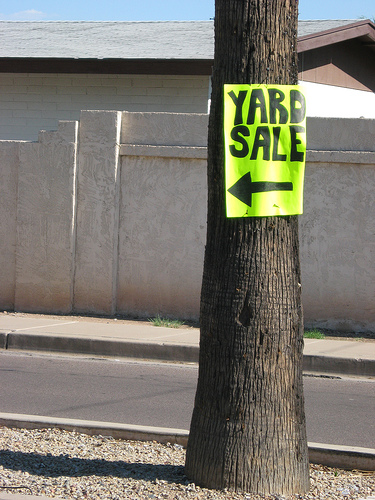
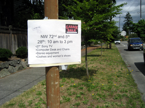
How do we get people to slow down on a street in the physical world? A sign. Let’s look at the ubiquitous yard sale sign. Which of the two signs below do you think is more effective?


No contest, right? The same rules apply on the information superhighway.
There are other real world examples that support five foot web design. My first job out of college was as an account coordinator at an ad agency. One of my tasks was writing up meeting notes. My first attempt was returned to me with more red on it than I’d seen in a long time. The message: say it with as few words as possible.
I also learned about one of their hiring techniques. Only the first page of a resume was reviewed. Any subsequent pages were thrown in the trash and never read. The lesson: brevity was and is critical, particularly in advertising.
Five foot web design simplifies your message and increases the odds that users will understand, remember and take action on that message. It will also help your search engine optimization (SEO) efforts.
The reason five foot web design supports SEO is that it forces you to use your keyword phrases prominently and to rely less on explanatory text and links. In short, it’ll help boost your keyword density.
You’ll need to use your headers wisely. Nice big H1s that don’t mince words. H2s and H3s that support your keyword(s). Strong anchor text. Judicious use of bold text. Strong call to action buttons. Keep it clean. White space is your friend.
Poker Copilot is a good example of five foot web design. Recently, they switched to much larger buttons in hopes of increasing downloads.
The spike at the end of the graph says it all. Spike is not even an adequate word here. It’s a kangaroo leap to a new level.
I also recommend the book Don’t Make Me Think by Steve Krug which presents a more detailed look at web design that dovetails nicely with five foot web design.
In lieu of additional reading, simply take a moment to step back from the computer, or roll back in your chair, and see if your site is befitting from five foot web design.
The Next Post: Hockey Memories
The Previous Post: AdWords Introduces Search Partners Metrics

4 trackbacks/pingbacks
Comments About Five Foot Web Design
// 1 comments so far.
Alec Rippberger // August 23rd 2012
Personally I find the sign on the right more convincing. I don’t have to read the signs to know they’re for yard sales, I know from experience (chances are they’re either signs for yard sales or for a lost dog/cat). The sign on the right sells me by listing some top-notch items that are for sale. The yard sale in the left image probably has a bunch of crap I don’t want.
Sorry, comments for this entry are closed at this time.
You can follow any responses to this entry via its RSS comments feed.