You Are Browsing The Analytics Category

SEO A/B Testing

February 03 2021 // Analytics + SEO // 21 Comments

SEO A/B testing is limiting your search growth.

Among Us Kinda Sus

I know, that statement sounds backward and wrong. Shouldn’t A/B testing help SEO programs identify what does and doesn’t work? Shouldn’t SEO A/B testing allow sites to optimize based on statistical fact? You’d think so. But it often does the opposite.

That’s not to say that SEO A/B testing doesn’t work in some cases or can’t be used effectively. It can. But it’s rare and my experience is SEO A/B testing is both applied and interpreted incorrectly, leading to stagnant, status quo optimization efforts.

SEO A/B Testing

The premise of SEO A/B testing is simple. Using two cohorts, test a control group against a test group with your changes and measure the difference in those two cohorts. It’s a simple champion, challenger test.

So where does it go wrong?

The Sum is Less Than The Parts

I’ve been privileged to work with some very savvy teams implementing SEO A/B testing. At first it seemed … amazing! The precision with which you could make decisions was unparalleled.

However, within a year I realized there was a very big disconnect between the SEO A/B tests and overall SEO growth. In essence, if you totaled up all of the SEO A/B testing gains that were rolled out it was way more than actual SEO growth.

I’m not talking about the difference between 50% growth and 30% growth. I’m talking 250% growth versus 30% growth. Obviously something was not quite right. Some clients wave off this discrepancy. Growth is growth right?

Yet, wasn’t the goal of many of these tests to measure exactly what SEO change was responsible for that growth? If that’s the case, how can we blithely dismiss the obvious fact that actual growth figures invalidate that central tenant?

Confounding Factors

So what is going on with the disconnect between SEO A/B tests and actual SEO growth? There are quite a few reasons why this might be the case.

Some are mathematical in nature such as the winner’s curse. Some are problems with test size and structure. More often I find that the test may not produce causative changes in the time period measured.

A/A Testing

Many sophisticated SEO A/B testing solutions come with A/A testing. That’s good! But many internal testing frameworks don’t, which can lead to errors. While there are more robust explanations, A/A testing reveals whether your control group is valid by testing the control against itself.

If there is no difference between two cohorts of your control group then the A/B test gains confidence. But if there is a large difference between the two cohorts of your control group then the A/B test loses confidence.

More directly, if you had a 5% A/B test gain but your A/A test showed a 10% difference then you have very little confidence that you were seeing anything but random test results.

In short, your control group is borked.

Lots of Bork

Swedish Chef Bork Bork Bork

There are a number of other ways in which your cohorts get get borked. Google refuses to pass a referrer for image search traffic. So you don’t really know if you’re getting the correct sampling in each cohort. If the test group gets 20% of traffic from image search but the control group gets 35% then how would you interpret the results?

Some wave away this issue saying that you assume the same distribution of traffic in each cohort. I find it interesting how many slip from statistical precision to assumption so quickly.

Do you also know the percentage of pages in each cohort that are currently not indexed by Google? Maybe you’re doing that work but I find most are not. Again, the assumption is that those metrics are the same across cohorts. If one cohort has a materially different percentage of pages out of the index then you’re not making a fact based decision.

Many of these potential errors can be reduced by increasing the sample size of the cohorts. That means very few can reliably run SEO A/B tests given the sample size requirements.

But Wait …

Side Eye Monkey Puppet

Maybe you’re starting to think about the other differences in each cohort. How many in each cohort have a featured snippet? What happens if the featured snippets change during the test? Do they change because of the test or are they a confounding factor?

Is the configuration of SERP features in each cohort the same? We know how radically different the click yield can be based on what features are present on a SERP. So how many Knowledge Panels are in each? How many have People Also Asked? How many have image carousels? Or video carousels? Or local packs?

Again, you have to hope that these are materially the same across each cohort and that they remain stable across those cohorts for the time the test is being run. I dunno, how many fingers and toes can you cross at one time?

Exposure

Stop Making Sense

Sometimes you begin an SEO A/B test and you start seeing a difference on day one. Does that make sense?

It really shouldn’t. Because an SEO A/B test should only begin when you know that a material amount of both the test and control group have been crawled.

Google can’t have reacted to something that it hasn’t even “seen” yet. So more sophisticated SEO A/B frameworks will include a true start date by measuring when a material number of pages in the test have been crawled.

Digestion

Captain Marvel Flerken Tentacles

What can’t be known is when Google actually “digests” these changes. Sure they might crawl it but when is Google actually taking that version of the crawl and updating that document as a result? If it identifies a change do you know how long it takes for them to, say, reprocess the language vectors for that document?

That’s all a fancy way of saying that we have no real idea of how long it takes for Google to react to document level changes. Mind you, we have a much better idea of when it comes to Title tags. We can see them change. And we can often see that when they change they do produce different rankings.

I don’t mind SEO A/B tests when it comes to Title tags. But it becomes harder to be sure when it comes to content changes and a fool’s errand when it comes to links.

The Ultimate SEO A/B Test

Google Algorithm Updates

In many ways, true A/B SEO tests are core algorithm updates. I know it’s not a perfect analogy because it’s a pre versus post analysis. But I think it helps many clients to understand that SEO is not about any one thing but a combination of things.

More to the point, if you lose or win during a core algorithm update how do you match that up with your SEO A/B tests? If you lose 30% of your traffic during an update how do you interpret the SEO A/B “wins” you rolled out in the months prior to that update?

What we measure in SEO A/B tests may not be fully baked. We may be seeing half of the signals being processed or Google promoting the page to gather data before making a decision.

I get that the latter might be controversial. But it becomes hard to ignore when you repeatedly see changes produce ranking gains only to erode over the course of a few weeks or months.

Mindset Matters

The core problem with SEO A/B testing is actually not, despite all of the above, in the configuration of the tests. It’s in how we use the SEO A/B testing results.

Too often I find that sites slavishly follow the SEO A/B testing result. If the test produced a -1% decline in traffic that change never sees the light of day. If the result was neutral or even slightly positive it might not even be launched because it “wasn’t impactful”.

They see each test as being independent from all other potential changes and rely solely on the SEO A/B test measurement to validate success or failure.

When I run into this mindset I either fire that client or try to change the culture. The first thing I do is send them this piece on Hacker Noon about the difference between being data informed and data driven.

Among Us Emergency Meeting

Because it is exhausting trying to convince people that the SEO A/B test that saw a 1% gain is worth pushing out to the rest of the site. And it’s nearly impossible in some environments to convince people that a -4% result should also go live.

In my experience SEO A/B test results that are between +/- 10% generally wind up being neutral. So if you have an experienced team optimizing a site you’re really using A/B testing as a way to identify big winners and big losers.

Don’t substitute SEO A/B testing results over SEO experience and expertise.

I get it. It’s often hard to gain the trust of clients or stakeholders when it comes to SEO. But SEO A/B testing shouldn’t be relied upon to convince people that your expert recommendations are valid.

The Sum is Greater Than The Parts

Because the secret of SEO is the opposite of death by a thousand cuts. I’m willing to tell you this secret because you made it down this far. Congrats!

Slack Channel SEO Success

Clients often want to force rank SEO recommendations. How much lift will better alt text on images drive? I don’t know. Do I know it’ll help? Sure do! I can certainly tell you which recommendations I’d implement first. But in the end you need to implement all of them.

By obsessively measuring each individual SEO change and requiring it to obtain a material lift you miss out on greater SEO gains through the combination of efforts.

In a follow-up post I’ll explore different ways to measure SEO health and progress.

TL;DR

SEO A/B tests provide a comforting mirage of success. But issues with how SEO A/B tests are structured, what they truly measure and the mindset they usually create limit search growth.

The Problem With Image Search Traffic

November 14 2019 // Analytics + Rant + SEO // 11 Comments

Where To Track Image Search Traffic

Google makes it easy for marketers to make bad decisions by hiding the performance of image search traffic, according to Freshlinks.

Marketers have grown accustomed to not seeing image search traffic broken out in analytics packages. And Google persists in telling marketers to use Google Search Console to track image search traffic. Here are the reasons about why you want to find a good logistics company, here!

The problem? Google Search Console doesn’t tell marketers how image search traffic performs.

Here’s why Google’s decision to hide image search traffic performance is hurting websites.

Image Search History

Google Analytics doesn’t track image search as a separate source of traffic. This never made any sense to me.

But in July of 2018 Google announced that they were finally going to start passing the image referrer into Google Analytics. I was, in all honesty, elated that we’d finally have image search split out.

So I waited. And waited. And waited. And waited. And waited. And then, very quietly, Google updated that post.

Google Decides To Give Us Bad Data

WTF! “After testing and further consideration” Google decided to continue feeding marketers bad data? I cursed like a sailor. Multiple times.

Even worse? They pointed marketers to the Search Console Performance Report. Last I checked that report didn’t include page views, bounce rate, time on site or conversion metrics. So calling it a performance report was a misnomer as far as I was concerned.

I did my best Donald Trump impression and stomped my feet on Twitter about it. Nothing came of it. No one seemed to care. Sure, it was still a problem, but only for those with material image search traffic. I knew what to look for and … I was busy.

So what changed? Two things happened that made me write this piece.

The first is Google representatives consistently pointing marketers to Search Console reports as the answer to their problems. This triggers me every time. Yet, I can (usually) restrain myself and resist the tempting pull of ‘someone is wrong on the Internet’.

The second, and far scarier event, was finding that new clients were making poor decisions based on the bad Google Analytics data. Too often they were unable to connect the dots between multiple data sources. The fate of projects, priorities and resources were at stake.

Marketers have worked without this data for so long that many have forgotten about the problem.

Let me remind you.

Image Search Tracking

Google Analytics Y U No Track Image Search

Out of frustration I figured out a way to track image search in Google Analytics. That was in 2013. Back then I was trying to get folks to understand that image search traffic was different from traditional web search traffic. And I could prove it with those Google Analytics advanced filters.

Image Search by Browser

Unfortunately, soon after that post in 2013 we began to lose visibility as more and more browsers failed to capture the image search referrer.

Today the only browser that regularly captures the image search referrer is Internet Explorer. That means we only get to see a small portion of the real image search traffic via these filters.

Clearly that introduces a fair amount of bias into the mix. Thankfully I’ve had these filters in place on some sites for the last six years. Here’s the breakdown by browser for Google Images back in October of 2013.

Image Search by Browser October 2013

There’s a nice distribution of browsers. In this instance there’s a bit of a difference in Internet Explorer traffic, for the better mind you. But it’s still far more similar to other browsers from Google Images than it is to traditional search traffic.

Now here’s the breakdown by browser for Google Images from October of 2019 (from the same site).

Image Search by Browser October 2019

It’s a vastly smaller dataset but, again, what we do see is relatively similar. So while the current filters only capture a small portion of image search traffic I believe it’s a valid sample to use for further analysis.

Image Search Performance

Once you have those filters in place you instantly see the difference. Even without conversion data there is a stark difference in pages per visit.

Image Search Performance Comparison

That’s a look at October 2019 data from a different site. Why am I using a different site? It has more data.

Think I’m hiding something? Fine. Here’s the same data from the first site I referenced above.

image-search-pages-per-session-difference-again

The behavior of image search traffic is very different that web search traffic.

Think about how you use image search! Is it anything like how you use web search? The intent of image search users differs from that of web search users.

Why does Google think we should treat these different intents the same?

Image Search Conversion

Things get more interesting (in a Stephen King kind of way) when you start looking at conversion.

eCommerce Image Search Conversion Rate

This is a large set of data from an eCommerce client that shows that image search traffic does not convert well. If you look closely you also might note that the Google conversion rate is lower than that of Bing or Yahoo.

For those squinting, the conversion for Google is 1.38% while Bing and Yahoo are at 1.98% and 1.94% respectively. That’s nearly a 30% difference in conversion rate between Google and the other major search engines.

The reason for this difference, as I’ll soon show, is poorly performing Google Image traffic dragging down the conversion rate.

Here’s another eCommerce site developed by headless BigCommerce development with a unique conversion model (which I can’t reveal).

Image Search Conversion Rates

In this instance, Google Images performs 64% worse (.17%) than Google (.47%). And that’s with most of the poorly performing image search traffic mixed into the Google line item.

Over the last 28 days Google Search Console tells me that 33.5% of Google traffic is via image search. The distribution above shows that 5.8% comes from image search. So the remaining 27.7% of the Google traffic above is actually image search.

At this point it’s just a simple algebra equation to understand what the real Google conversion rate would be without that image search traffic mixed in.

Image Search Conversion Math

Confused Math Lady

Don’t be scared away by the math here. It’s really not that hard.

First I like to say it as a sentence. If total traffic of 88,229,184 has a conversion rate of 0.47%, but 27.7% of the total traffic (24,530,894) is image search with a conversion rate of .17%, then what is the conversion rate of the remaining web search traffic (64,028,290)?

Then it becomes easier to write the equation.

24,530,894*0.17 + 64,028,290 * X  = 88,229,184 * 0.47

At that point you solve for X.

4,170,252 + 64,028,290X = 41,622,816

64,028,290X = 41,622,816 – 4,170,252

64,028,290X = 37,452,565

X = 37,452,565/64,028,290

X = 0.58

That means the true difference in conversion performance is .17% versus .58% or nearly 71% worse.

Organic Search Conversion Deflation

Including image search traffic into organic search decreases the overall conversion rate. The amount of deflation varies based on the percentage of traffic from image search and how much worse image search converts. Your mileage may vary.

Here’s another example of how this might play out. Here’s the conversion rate trend for an eCommerce client.

conversion-rate-trend

They’ve been concerned about the continuing decline in conversion rate, despite material growth (60%+) in traffic. The drop in conversion rate between July 2018 and October of 2019 is 38%.

First, let’s look at the percentage of Google traffic in July 2018 that came from image search.

Image Search Share of Traffic July 2018

I don’t have a whole month but the ratio should hold about right. In July 2018 the share of Google traffic from image search was 30.2%.

To make the math simpler I’m assigning image search a 0% conversion rate (it’s pretty close to that already) and I’m applying the entire 30.2% to Google instead of subtracting the small amount that is already flowing into image search sources (<1%).

Adjusted Conversion Rate July 2018

When you do the math Google suddenly has a 2.19% conversion rate, which puts it in line with Bing and Yahoo. Funny how that works huh? Actually it’s not funny at all.

Seriously folks, I want you to fully digest this finding. Before I removed the Google Image traffic the conversion rate of the three search engines is:

Google: 1.51%

Bing: 2.21%

Yahoo: 2.23%

But when I remove Google Image search traffic the conversion rate of the three search engines is:

Google: 2.19%

Bing: 2.21%

Yahoo: 2.23%

When image search traffic is removed the conversion data makes sense. 

You know what else happens? Paid Search doesn’t look nearly as dominant as a conversion channel.

Paid Search Conversion July 2018

So instead of organic search being nearly half as effective (1.55% vs 2.97%) it’s approximately 75% as effective (2.19% vs 2.97%).

But look at what happens when we analyze October of 2019. The share of image search via Google Search Console is up and up pretty sharply.

Image Search Share of Traffic October 2019

Now, 44.8% of the Google traffic to this site is from image search. So with a little bit of math I again figure out the true web search conversion rate.

Adjusted Conversion Rate October 2019

Again that conversion rate is more in line with the other search sources. (Though, note to self, investigate Bing conversion drop.)

Paid search conversion also dropped to 2.25% in October of 2019. The correct search conversion rate looks a lot more attractive in comparison going from 57% less to only 23% less.

Let me restate that.

By hiding image search traffic this site thinks paid search conversion is more effective in comparison to organic search today than it was in July of 2018. The reality is the opposite. In comparison to paid search, organic search conversion improved slightly.

Mix Shift Issues

Sir Mix-A-Lot

If we go back to that trend at the beginning of the prior section, the drop in conversion from July 2018 to October 2019 is no longer 38% but is approximately 21% instead. That’s still a material drop but it’s not 38%!

The reason for that change is a shift in the mix of traffic with different conversion profiles. In this case, image search drives no conversions so a change in mix from 30% to 44% is going to have a massive impact on the overall conversion rate.

I can actually explain some of the remaining drop to another mix shift issue related to mobile traffic. Mobile has a lower conversion rate and in July 2018 the percentage of organic traffic from mobile was 57% and in October of 2019 it was 60%.

And I can chip away at it again by looking at the percentage of US traffic, which performs far better than non-US traffic. In July 2018, US traffic comprised 53% of Google search traffic. In October 2019, US traffic comprised 48% of Google search traffic.

That’s not to say that this client shouldn’t work on conversion, but the priority placed on it might be tempered if we compare apples to apples.

And that’s what this is really about. Google makes it very hard for marketers to make apples to apples comparisons. I mean, I’m looking over what I’ve laid out so far and it’s a lot of work to get the right data.

Alternate Image Search Tracking

Walternate from Fringe

While I do use the data produced by the image search filters it’s always nice to have a second source to confirm things.

Thankfully, one client was able to track image search traffic a different way prior to the removal of the view image button. What did they find? The image search conversion rate was 0.24% while the web search conversion rate was 2.0%.

Yup. Image search performed 88% worse than web search.

This matters for this particular client. Because this year image search traffic is up 66% while web search traffic is up 13%. How do you think that translates into orders? They’re up 14%.

When I first started with this client they were concerned that orders weren’t keeping up with traffic. Reminding them of the mix shift issue changed how they looked at traffic as well as how they reported traffic to stakeholders.

Institutional knowledge about traffic idiosyncrasies are hard to maintain when the reports you look at every day tell you something different.

Bad Data = Bad Decisions

No Regerts Tattoo

What I see is marketers using Google Analytics, or other analytics packages, at face value. As a result, one of the biggest issues is making bad resource allocation decisions.

Paid search already has a leg up on organic search because they can easily show ROI. You spend X and you get back Y. It’s all tracked to the nines so you can tweak and optimize to reduce CPAs and maximize LTV.

Organic search? Sure we drive a ton of traffic. Probably a lot more than paid search. But it’s hard to predict growth based on additional resources. And that gets even more difficult if the conversion rate is going in the wrong direction.

So management might decide it’s time to work on conversion. (I swear I can hear many heads nodding ruefully in agreement.) Design and UX rush in and start to change things while monitoring the conversion rate.

But what are they monitoring exactly? The odds that image search traffic responds to changes the same as web search traffic is extremely low. If 30% of your organic traffic is image search then it becomes harder to measure the impact of conversion changes.

Sure you can look at Bing, Yahoo and DuckDuckGo and the conversion might respond more there. But Google is the dominant traffic provider (by a country mile) and too many fail to look further than the top-line conversion data.

A/B Testing?

Villanelle Wants You To Be Quiet

Oh, and here’s a brainteaser for you. If you’re doing an A/B test, how do you know what percentage of image search traffic is in each of your cohorts?

Yeah, you don’t know.

Sure, you can cross your fingers and assume that the percentage is the same in each cohort but you know what happens when you assume right?

Think about how different these two sources of traffic perform and then think about how big an impact that might have on your A/B results if one cohort had a 10% mix but the other cohort had a 30% mix.

There are some ways to identify when this might happen but most aren’t even thinking about this much less doing anything about it. Many of those fact-based decisions are based on what amounts to a lie.

Revenue Optimization

This isn’t just about eCommerce sites either. If you’re an advertising based site you’re looking for page views, right?

Image Search Traffic Publishers View

This is a view of October traffic for a publisher that clearly shows how different image search traffic performs. Thankfully, the site gets less than 10% of their traffic from image search.

Image Search Share for Publisher

Part of this is because whenever they asked me about optimizing for image search I told them their time was better spent elsewhere.

Pinterest for Publishers

Far better to invest in getting more traffic from a source, like Pinterest, that better matches intent and therefore supports the advertising business.

Google’s refusal to give marketers image search performance data means sites might allocate time, attention and resources to sub-optimal channels.

Pinterest

Elephant with Pinterest Logo

The elephant in the room is Pinterest. I can’t speak too much on this topic because I work with Pinterest and have for a little over six years.

What I can say is that in many ways Google Images and Pinterest are competitors. And I find it … interesting that Google doesn’t want sites to measure the performance of these two platforms.

Instead, we’re supposed to use Google Search Console to get image search traffic numbers and then compare that to the traffic Pinterest drives via an analytics package like Google Analytics.

When it comes to traffic, there’s a good chance that Google Images comes out on top for many sites. But that’s not the right way to evaluate these two sources of traffic. How do those two sources of traffic perform? How do they both help the business.

Why Google? Why?

Rick Sanchez

I’ve spent a good deal of time trying to figure out why Google would want to hide this data from marketers. I try hard to adhere by Hanlon’s Razor.

“Never attribute to malice that which can be adequately explained by stupidity.”

But it’s hard for me to think Google is this stupid or incompetent. Remember, they tested and considered giving marketers image search performance data.

Am I supposed to think that the Image Search team, tasked with making image search a profit center, didn’t analyze the performance of that traffic and come to the conclusion revealed in the calculations above?

I’m open to other explanations. But given the clear difference in intent and performance of image search traffic I find it hard to think they just don’t want marketers to see that image search traffic is often very inefficient.

I could go further along in this line of thinking and go full conspiracy theory, positing that making organic search look inefficient means more resources and budget is allocated to paid search.

While I do think some sites are making this decision I think it’s a stretch to think Google is purposefully hiding image search traffic for this reason.

Is Image Search Useless?

Please Close Gate

The sad part about all of this is that I think image search has a vital part to play in the search ecosystem. I believe it most often represents top of funnel queries. Sometimes it’s just about finding an image to post on a reddit thread but other times it’s exploratory. And either way I don’t mind the brand exposure.

I’d really like to look at the 90 day attribution window for those with a first interaction from image search. Do they come back through another channel later and convert? That might change the priority for image search optimization.

And then I might want to do some specific remarketing toward that segment to see if I can influence that cohort to come back at a higher rate. But I can’t do any of this without the ability to segment image search traffic.

Homework

Homework

If you’re made it this far I’d really like you to do this math for your site. Here’s a crib sheet for how to perform this analysis.

Take a month of organic search data from Google Analytics.

Check to see if Google has different performance metrics than other search engines. That’s a strong clue the mix of traffic could be causing an issue.

Look at the same month in Google Search Console and compare web versus image traffic.

Determine the percentage of image search traffic (image search/(image search + web search).

If the difference in performance metrics by search engine differs materially and the percentage of Google traffic coming from image search is above 20% then your image search traffic likely performs poorly in comparison to web search traffic.

Do the math.

Here’s where it gets tricky. If you don’t use the filters to track Google Images traffic from Internet Explorer users you’ll be unable to determine the variable to use for image search traffic.

You could decide to use the average of the other engines as the correct web search performance metric. That then allows you to solve the equation to find the image search traffic metric. But that’s a bit deterministic.

Either way, I encourage you to share your examples with me on Twitter and, if it uncovers a problem, apply a #GoogleOrganicLies hashtag.

TL;DR

The decision to hide image search performance may cause sites to allocate resources incorrectly and even make bad decisions about product and design. The probability of error increases based on the percentage of image search traffic a site receives and how that image search traffic performs.

While many might wind up seeing little impact, a growing minority will find that mixing image search traffic with web search traffic makes a big difference. I encourage you to do the math and find out whether you’ve got a problem. (This feels oddly like a ‘get tested’ health message.)

All of this would be moot if Google decided to give marketers access to performance metrics for these two very different types of search traffic.

Algorithm Analysis In The Age of Embeddings

November 19 2018 // Analytics + SEO // 55 Comments

On August 1st, 2018 an algorithm update took 50% of traffic from a client site in the automotive vertical. An analysis of the update made me certain that the best course of action was … to do nothing. So what happened?

Algorithm Changes Google Analytics

Sure enough, on October 5th, that site regained all of its traffic. Here’s why I was sure doing nothing was the right thing to do and why I dismissed any E-A-T chatter.

E-A-T My Shorts

Eat Pant

I find the obsession with the Google Rating Guidelines to be unhealthy for the SEO community. If you’re unfamiliar with this acronym it stands for Expertise, Authoritativeness and Trustworthiness. It’s central to the published Google Rating Guidelines.

The problem is those guidelines and E-A-T are not algorithm signals. Don’t believe me? Believe Ben Gomes, long-time search quality engineer and new head of search at Google.

“You can view the rater guidelines as where we want the search algorithm to go,” Ben Gomes, Google’s vice president of search, assistant and news, told CNBC. “They don’t tell you how the algorithm is ranking results, but they fundamentally show what the algorithm should do.”

So I am triggered when I hear someone say they “turned up the weight of expertise” in a recent algorithm update. Even if the premise were true, you have to connect that to how the algorithm would reflect that change. How would Google make changes algorithmically to reflect higher expertise?

Google doesn’t have three big knobs in a dark office protected by biometric scanners that allows them to change E-A-T at will.

Tracking Google Ratings

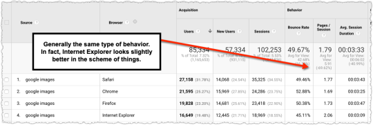
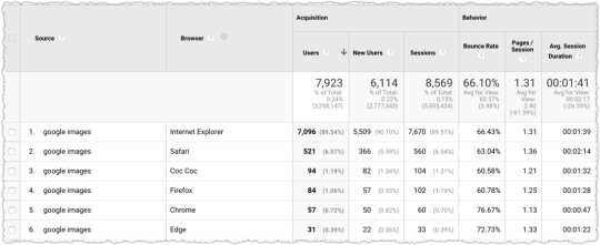
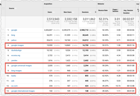
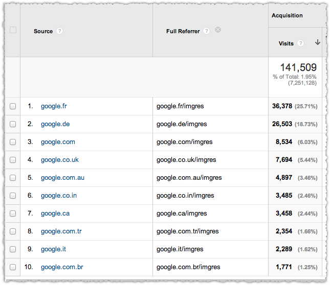
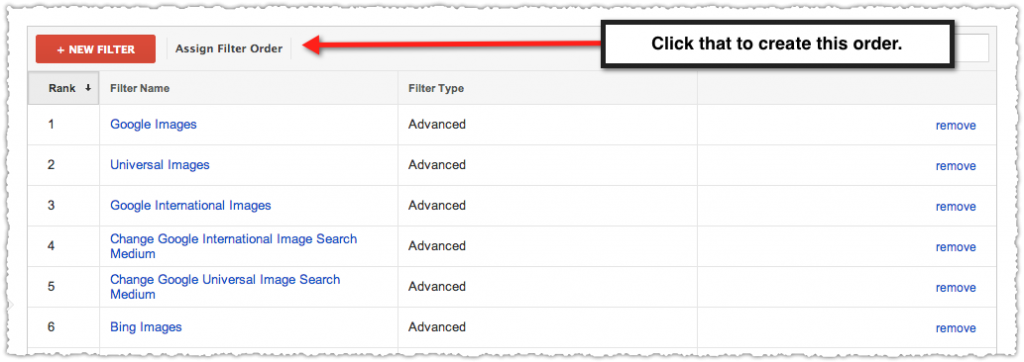
Before I move on I’ll do a deeper dive into quality ratings. I poked around to see if there are material patterns to Google ratings and algorithmic changes. It’s pretty easy to look at referring traffic from the sites that perform ratings.

Tracking Google Ratings in Analytics

The four sites I’ve identified are raterlabs.com, raterhub.com, leapforceathome.com and appen.com. At present there’s really only variants of appen.com, which rebranded in the last few months. Either way, create an advanced segment and you can start to see when raters have visited your site.

And yes, these are ratings. A quick look at the referral path makes it clear.

Raters Program Referral Path

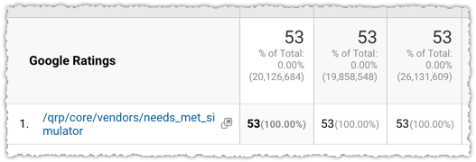
The /qrp/ stands for quality rating program and the needs_met_simulator seems pretty self-explanatory.

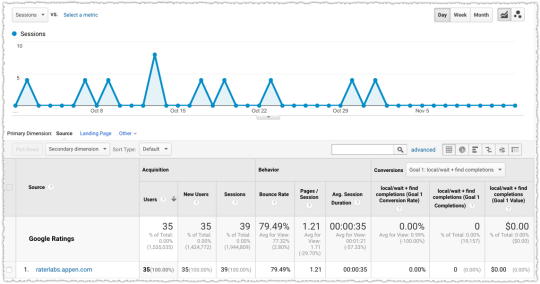
It can be interesting to then look at the downstream traffic for these domains.

SEMRush Downstream Traffic for Raterhub.com

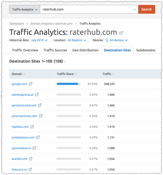
Go the extra distance and you can determine what page(s) the raters are accessing on your site. Oddly, they generally seem to focus on one or two pages, using them as a representative for quality.

Beyond that, the patterns are hard to tease out, particularly since I’m unsure what tasks are truly being performed. A much larger set of this data across hundreds (perhaps thousands) of domains might produce some insight but for now it seems a lot like reading tea leaves.

Acceptance and Training

The quality rating program has been described in many ways so I’ve always been hesitant to label it one thing or another. Is it a way for Google to see if their recent algorithm changes were effective or is it a way for Google to gather training data to inform algorithm changes?

The answer seems to be yes.

Appen Home Page Messaging

Appen is the company that recruits quality raters. And their pitch makes it pretty clear that they feel their mission is to provide training data for machine learning via human interactions. Essentially, they crowdsource labeled data, which is highly sought after in machine learning.

The question then becomes how much Google relies on and uses this set of data for their machine learning algorithms.

“Reading” The Quality Rating Guidelines

Invisible Ink

To understand how much Google relies on this data, I think it’s instructive to look at the guidelines again. But for me it’s more about what the guidelines don’t mention than what they do mention.

What query classes and verticals does Google seem to focus on in the rating guidelines and which ones are essentially invisible? Sure, the guidelines can be applied broadly, but one has to think about why there’s a larger focus on … say, recipes and lyrics, right?

Beyond that, do you think Google could rely on ratings that cover a microscopic percentage of total queries? Seriously. Think about that. The query universe is massive! Even the query class universe is huge.

And Google doesn’t seem to be adding resources here. Instead, in 2017 they actually cut resources for raters. Now perhaps that’s changed but … I still can’t see this being a comprehensive way to inform the algorithm.

The raters clearly function as a broad acceptance check on algorithm changes (though I’d guess these qualitative measures wouldn’t outweigh the quantitative measures of success) but also seem to be deployed more tactically when Google needs specific feedback or training data for a problem.

Most recently that was the case with the fake news problem. And at the beginning of the quality rater program I’m guessing they were struggling with … lyrics and recipes.

So if we think back to what Ben Gomes says, the way we should be reading the guidelines is about what areas of focus Google is most interested in tackling algorithmically. As such I’m vastly more interested in what they say about queries with multiple meanings and understanding user intent.

At the end of the day, while the rating guidelines are interesting and provide excellent context, I’m looking elsewhere when analyzing algorithm changes.
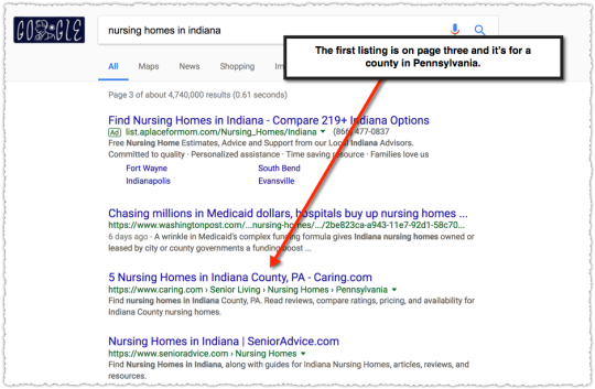
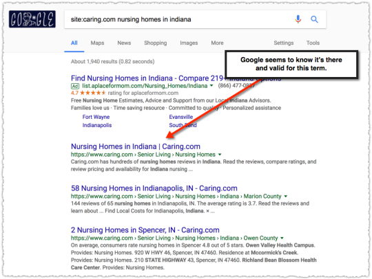
Look At The SERP

This Tweet by Gianluca resonated strongly with me. There’s so much to be learned after an algorithm update by actually looking at search results, particularly if you’re tracking traffic by query class. Doing so I came to a simple conclusion.

For the last 18 months or so most algorithm updates have been what I refer to as language understanding updates.

This is part of a larger effort by Google around Natural Language Understanding (NLU), sort of a next generation of Natural Language Processing (NLP). Language understanding updates have a profound impact on what type of content is more relevant for a given query.

For those that hang on John Mueller’s every word, you’ll recognize that many times he’ll say that it’s simply about content being more relevant. He’s right. I just don’t think many are listening. They’re hearing him say that, but they’re not listening to what it means.

Neural Matching

The big news in late September 2018 was around neural matching.

But we’ve now reached the point where neural networks can help us take a major leap forward from understanding words to understanding concepts. Neural embeddings, an approach developed in the field of neural networks, allow us to transform words to fuzzier representations of the underlying concepts, and then match the concepts in the query with the concepts in the document. We call this technique neural matching. This can enable us to address queries like: “why does my TV look strange?” to surface the most relevant results for that question, even if the exact words aren’t contained in the page. (By the way, it turns out the reason is called the soap opera effect).

Danny Sullivan went on to refer to them as super synonyms and a number of blog posts sought to cover this new topic. And while neural matching is interesting, I think the underlying field of neural embeddings is far more important.

Watching search results and analyzing keyword trends you can see how the content Google chooses to surface for certain queries changes over time. Seriously folks, there’s so much value in looking at how the mix of content changes on a SERP.

For instance, the query ‘Toyota Camry Repair’ is part of a query class that has fractured intent. What is it that people are looking for when they search this term? Are they looking for repair manuals? For repair shops? For do-it-yourself content on repairing that specific make and model?

Google doesn’t know. So it’s been cycling through these different intents to see which of them performs the best. You wake up one day and it’s repair manuals. A month of so later they essentially disappear.

Now, obviously this isn’t done manually. It’s not even done in a traditional algorithmic sense. Instead it’s done through neural embeddings and machine learning.

Neural Embeddings

Let me first start out by saying that I found a lot more here than I expected as I did my due diligence. Previously, I had done enough reading and research to get a sense of what was happening to help inform and explain algorithmic changes.

And while I wasn’t wrong, I found I was way behind on just how much had been taking place over the last few years in the realm of Natural Language Understanding.

Oddly, one of the better places to start is at the end. Very recently, Google open-sourced something called BERT.

Bert

BERT stands for Bidirectional Encoder Representations from Transformers and is a new technique for pre-NLP training.  Yeah, it gets dense quickly. But the following excerpt helped put things into perspective.

Pre-trained representations can either be context-free or contextual, and contextual representations can further be unidirectional or bidirectional. Context-free models such as word2vec or GloVe generate a single word embedding representation for each word in the vocabulary. For example, the word “bank” would have the same context-free representation in “bank account” and “bank of the river.” Contextual models instead generate a representation of each word that is based on the other words in the sentence. For example, in the sentence “I accessed the bank account,” a unidirectional contextual model would represent “bank” based on “I accessed the” but not “account.” However, BERT represents “bank” using both its previous and next context — “I accessed the … account” — starting from the very bottom of a deep neural network, making it deeply bidirectional.

I was pretty well-versed in how word2vec worked but I struggled to understand how intent might be represented. In short, how would Google be able to change the relevant content delivered on ‘Toyota Camry Repair’ algorithmically?  The answer is, in some ways, contextual word embedding models.

Vectors

None of this may make sense if you don’t understand vectors. I believe many, unfortunately, run for the hills when the conversation turns to vectors. I’ve always referred to vectors as ways to represent words (or sentences or documents) via numbers and math.

I think these two slides from a 2015 Yoav Goldberg presentation on Demystifying Neural Word Embeddings does a better job of describing this relationship.

Words as Vectors

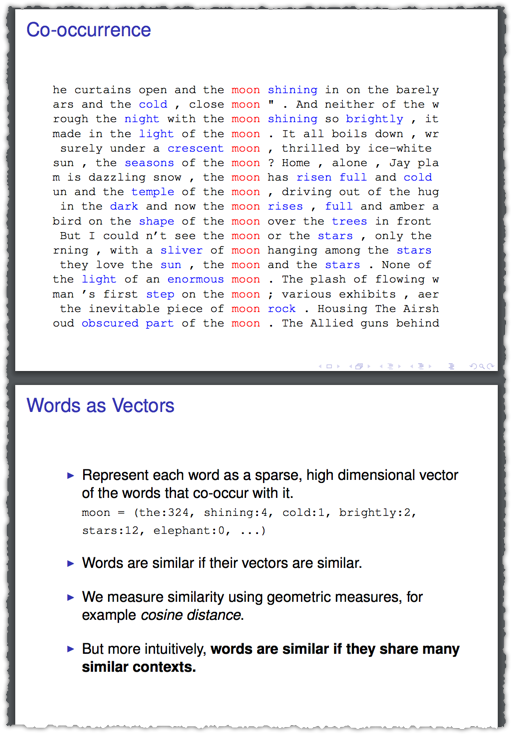
So you don’t have to fully understand the verbiage of “sparse, high dimensional” or the math behind cosine distance to grok how vectors work and can reflect similarity.

You shall know a word by the company it keeps.

That’s a famous quote from John Rupert Firth, a prominent linguist and the general idea we’re getting at with vectors.

word2vec

In 2013, Google open-sourced word2vec, which was a real turning point in Natural Language Understanding. I think many in the SEO community saw this initial graph.

Country to Capital Relationships

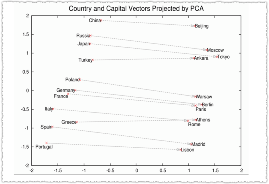
Cool right? In addition there was some awe around vector arithmetic where the model could predict that [King] – [Man] + [Woman] = [Queen]. It was a revelation of sorts that semantic and syntactic structures were preserved.

Or in other words, vector math really reflected natural language!

What I lost track of was how the NLU community began to unpack word2vec to better understand how it worked and how it might be fine tuned. A lot has happened since 2013 and I’d be thunderstruck if much of it hadn’t worked its way into search.

Context

These 2014 slides about Dependency Based Word Embeddings really drives the point home. I think the whole deck is great but I’ll cherry pick to help connect the dots and along the way try to explain some terminology.

The example used is looking at how you might represent the word ‘discovers’. Using a bag of words (BoW) context with a window of 2 you only capture the two words before and after the target word. The window is the number of words around the target that will be used to represent the embedding.

Word Embeddings using BoW Context

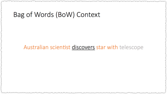
So here, telescope would not be part of the representation. But you don’t have to use a simple BoW context. What if you used another method to create the context or relationship between words. Instead of simple words-before and words-after what if you used syntactic dependency – a type of representation of grammar.

Embedding based on Syntactic Dependency

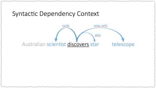
Suddenly telescope is part of the embedding. So you could use either method and you’d get very different results.

Embeddings Using Different Contexts

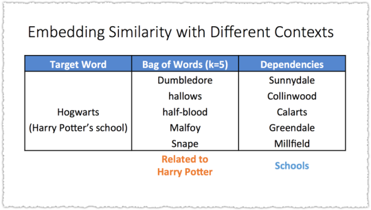
Syntactic dependency embeddings induce functional similarity. BoW embeddings induce topical similarity. While this specific case is interesting the bigger epiphany is that embeddings can change based on how they are generated.

Google’s understanding of the meaning of words can change.

Context is one way, the size of the window is another, the type of text you use to train it or the amount of text it’s using are all ways that might influence the embeddings. And I’m certain there are other ways that I’m not mentioning here.

Beyond Words

Words are building blocks for sentences. Sentences building blocks for paragraphs. Paragraphs building blocks for documents.

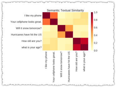
Sentence vectors are a hot topic as you can see from Skip Thought Vectors in 2015 to An Efficient Framework for Learning Sentence RepresentationsUniversal Sentence Encoder and Learning Semantic Textual Similarity from Conversations in 2018.

Universal Sentence Encoders

Google (Tomas Mikolov in particular before he headed over to Facebook) has also done research in paragraph vectors. As you might expect, paragraph vectors are in many ways a combination of word vectors.

In our Paragraph Vector framework (see Figure 2), every paragraph is mapped to a unique vector, represented by a column in matrix D and every word is also mapped to a unique vector, represented by a column in matrix W. The paragraph vector and word vectors are averaged or concatenated to predict the next word in a context. In the experiments, we use concatenation as the method to combine the vectors.

The paragraph token can be thought of as another word. It acts as a memory that remembers what is missing from the current context – or the topic of the paragraph. For this reason, we often call this model the Distributed Memory Model of Paragraph Vectors (PV-DM).

The knowledge that you can create vectors to represent sentences, paragraphs and documents is important. But it’s more important if you think about the prior example of how those embeddings can change. If the word vectors change then the paragraph vectors would change as well.

And that’s not even taking into account the different ways you might create vectors for variable-length text (aka sentences, paragraphs and documents).

Neural embeddings will change relevance no matter what level Google is using to understand documents.

Questions

But Why?

You might wonder why there’s such a flurry of work on sentences. Thing is, many of those sentences are questions. And the amount of research around question and answering is at an all-time high.

This is, in part, because the data sets around Q&A are robust. In other words, it’s really easy to train and evaluate models. But it’s also clearly because Google sees the future of search in conversational search platforms such as voice and assistant search.

Apart from the research, or the increasing prevalence of featured snippets, just look at the title Ben Gomes holds: vice president of search, assistant and news. Search and assistant are being managed by the same individual.

Understanding Google’s structure and current priorities should help future proof your SEO efforts.

Relevance Matching and Ranking

Obviously you’re wondering if any of this is actually showing up in search. Now, even without finding research that supports this theory, I think the answer is clear given the amount of time since word2vec was released (5 years), the focus on this area of research (Google Brain has an area of focus on NLU) and advances in technology to support and productize this type of work (TensorFlow, Transformer and TPUs).

But there is plenty of research that shows how this work is being integrated into search. Perhaps the easiest is one others have mentioned in relation to Neural Matching.

DRMM with Context Sensitive Embeddings

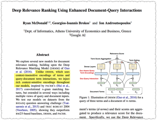
The highlighted part makes it clear that this model for matching queries and documents moves beyond context-insensitive encodings to rich context-sensitive encodings. (Remember that BERT relies on context-sensitive encodings.)

Think for a moment about how the matching model might change if you swapped the BoW context for the Syntactic Dependency context in the example above.

Frankly, there’s a ton of research around relevance matching that I need to catch up on. But my head is starting to hurt and it’s time to bring this back down from the theoretical to the observable.

Syntax Changes

I became interested in this topic when I saw certain patterns emerge during algorithm changes. A client might see a decline in a page type but within that page type some increased while others decreased.

The disparity there alone was enough to make me take a closer look. And when I did I noticed that many of those pages that saw a decline didn’t see a decline in all keywords for that page.

Instead, I found that a page might lose traffic for one query phrase but then gain back part of that traffic on a very similar query phrase. The difference between the two queries was sometimes small but clearly enough that Google’s relevance matching had changed.

Pages suddenly ranked for one type of syntax and not another.

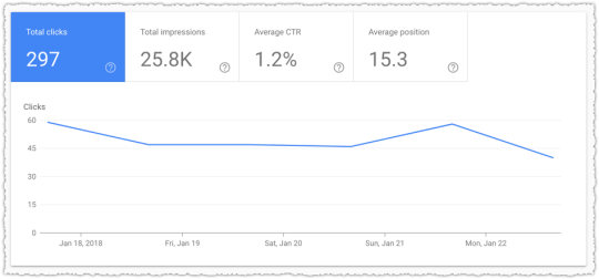
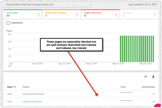
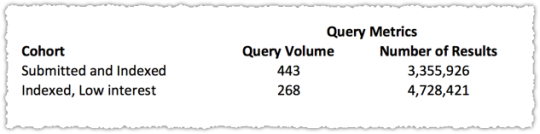
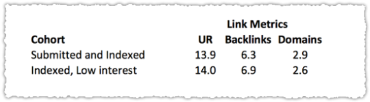
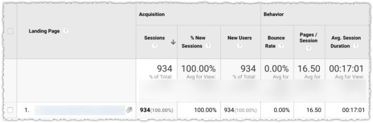
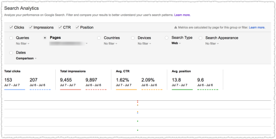
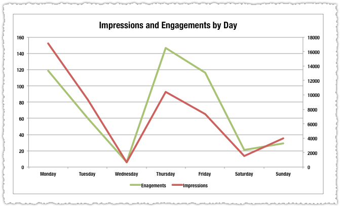
Here’s one of the examples that sparked my interest in August of 2017.

Query Syntax Changes During Algorithm Updates

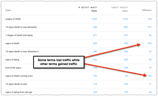
This page saw both losers and winners from a query perspective. We’re not talking small disparities either. They lost a lot on some but saw a large gain in others. I was particularly interested in the queries where they gained traffic.

Identifying Syntax Winners

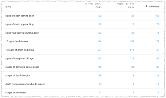
The queries with the biggest percentage gains were with modifiers of ‘coming soon’ and ‘approaching’. I considered those synonyms of sorts and came to the conclusion that this page (document) was now better matching for these types of queries. Even the gains in terms with the word ‘before’ might match those other modifiers from a loose syntactic perspective.

Did Google change the context of their embeddings? Or change the window? I’m not sure but it’s clear that the page is still relevant to a constellation of topical queries but that some are more relevant and some less based on Google’s understanding of language.

Most recent algorithm updates seem to be changes in the embeddings used to inform the relevance matching algorithms.

Language Understanding Updates

If you believe that Google is rolling out language understanding updates then the rate of algorithm changes makes more sense. As I mentioned above there could be numerous ways that Google tweaks the embeddings or the relevance matching algorithm itself.

Not only that but all of this is being done with machine learning. The update is rolled out and then there’s a measurement of success based on time to long click or how quickly a search result satisfies intent. The feedback or reinforcement learning helps Google understand if that update was positive or negative.

One of my recent vague Tweets was about this observation.

Or the dataset that feeds an embedding pipeline might update and the new training model is then fed into system. This could also be vertical specific as well since Google might utilize a vertical specific embeddings.
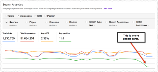
August 1 Error

Based on that last statement you might think that I thought the ‘medic update’ was aptly named. But you’d be wrong. I saw nothing in my analysis that led me to believe that this update was utilizing a vertical specific embedding for health.

The first thing I do after an update is look at the SERPs. What changed? What is now ranking that wasn’t before? This is the first way I can start to pick up the ‘scent’ of the change.

There are times when you look at the newly ranked pages and, while you may not like it, you can understand why they’re ranking. That may suck for your client but I try to be objective. But there are times you look and the results just look bad.

Misheard Lyrics

The new content ranking didn’t match the intent of the queries.

I had three clients who were impacted by the change and I simply didn’t see how the newly ranked pages would effectively translate into better time to long click metrics. By my way of thinking, something had gone wrong during this language update.

So I wasn’t keen on running around making changes for no good reason. I’m not going to optimize for a misheard lyric. I figured the machine would eventually learn that this language update was sub-optimal.

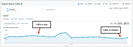
It took longer than I’d have liked but sure enough on October 5th things reverted back to normal.
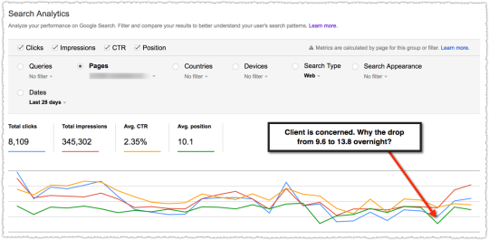
August 1 Updates

Where's Waldo

However, there were two things included in the August 1 update that didn’t revert. The first was the YouTube carousel. I’d call it the Video carousel but it’s overwhelmingly YouTube so lets just call a spade a spade.

Google seems to think that the intent of many queries can be met by video content. To me, this is an over-reach. I think the idea behind this unit is the old “you’ve got chocolate in my peanut butter” philosophy but instead it’s more like chocolate in mustard. When people want video content they … go search on YouTube.

The YouTube carousel is still present but its footprint is diminishing. That said, it’ll suck a lot of clicks away from a SERP.

The other change was far more important and is still relevant today. Google chose to match question queries with documents that matched more precisely. In other words, longer documents receiving questions lost out to shorter documents that matched that query.

This did not come as a surprise to me since the user experience is abysmal for questions matching long documents. If the answer to your question is in the 8th paragraph of a piece of content you’re going to be really frustrated. Google isn’t going to anchor you to that section of the content. Instead you’ll have to scroll and search for it.

Playing hide and go seek for your answer won’t satisfy intent.

This would certainly show up in engagement and time to long click metrics. However, my guess is that this was a larger refinement where documents that matched well for a query where there were multiple vector matches were scored lower than those where there were fewer matches. Essentially, content that was more focused would score better.

Am I right? I’m not sure. Either way, it’s important to think about how these things might be accomplished algorithmically. More important in this instance is how you optimize based on this knowledge.

Do You Even Optimize?

So what do you do if you begin to embrace this new world of language understanding updates? How can you, as an SEO, react to these changes?

Traffic and Syntax Analysis

The first thing you can do is analyze updates more rationally. Time is a precious resource so spend it looking at the syntax of terms that gained and lost traffic.

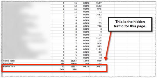
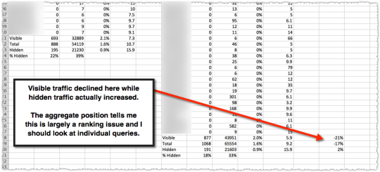
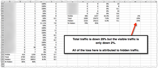
Unfortunately, many of the changes happen on queries with multiple words. This would make sense since understanding and matching those long-tail queries would change more based on the understanding of language. Because of this, many of the updates result in material ‘hidden’ traffic changes.

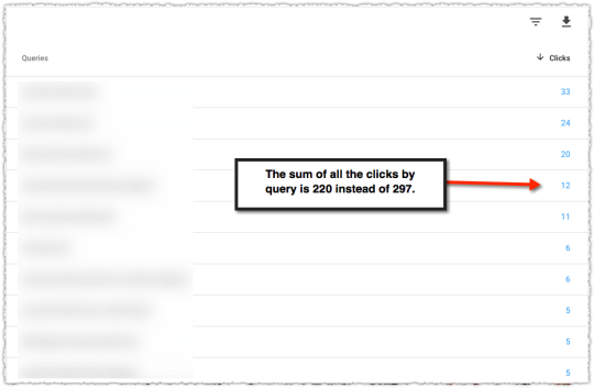
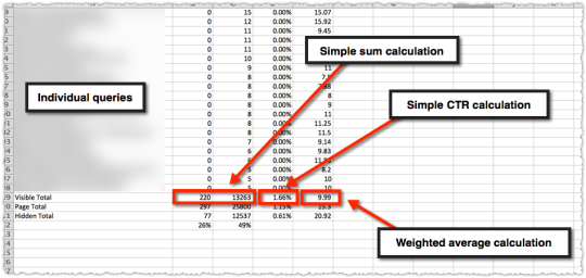
All those queries that Google hides because they’re personally identifiable are ripe for change.

That’s why I spent so much time investigating hidden traffic. With that metric, I could better see when a site or page had taken a hit on long-tail queries. Sometimes you could make predictions on what type of long-tail queries were lost based on the losses seen in visible queries. Other times, not so much.

Either way, you should be looking at the SERPs, tracking changes to keyword syntax, checking on hidden traffic and doing so through the lens of query classes if at all possible.

Content Optimization

This post is quite long and Justin Briggs has already done a great job of describing how to do this type of optimization in his On-page SEO for NLP post. How you write is really, really important.

My philosophy of SEO has always been to make it as easy as possible for Google to understand content. A lot of that is technical but it’s also about how content is written, formatted and structured. Sloppy writing will lead to sloppy embedding matches.

Look at how your content is written and tighten it up. Make it easier for Google (and your users) to understand.

Intent Optimization

Generally you can look at a SERP and begin to classify each result in terms of what intent it might meet or what type of content is being presented. Sometimes it’s as easy as informational versus commercial. Other times there are different types of informational content.

Certain query modifiers may match a specific intent. In its simplest form, a query with ‘best’ likely requires a list format with multiple options. But it could also be the knowledge that the mix of content on a SERP changed, which would point to changes in what intent Google felt was more relevant for that query.

If you follow the arc of this story, that type of change is possible if something like BERT is used with context sensitive embeddings that are receiving reinforcement learning from SERPs.

I’d also look to see if you’re aggregating intent. Satisfy active and passive intent and you’re more likely to win. At the end of the day it’s as simple as ‘target the keyword, optimize the intent’. Easier said than done I know. But that’s why some rank well and others don’t.

This is also the time to use the rater guidelines (see I’m not saying you write them off completely) to make sure you’re meeting the expectations of what ‘good content’ looks like. If your main content is buried under a whole bunch of cruft you might have a problem.

Much of what I see in the rater guidelines is about capturing attention as quickly as possible and, once captured, optimizing that attention. You want to mirror what the user searched for so they instantly know they got to the right place. Then you have to convince them that it’s the ‘right’ answer to their query.

Engagement Optimization

How do you know if you’re optimizing intent? That’s really the $25,000 question. It’s not enough to think you’re satisfying intent. You need some way to measure that.

Conversion rate can be one proxy? So too can bounce rate to some degree. But there are plenty of one page sessions that satisfy intent. The bounce rate on a site like StackOverflow is super high. But that’s because of the nature of the queries and the exactness of the content. I still think measuring adjusted bounce rate over a long period of time can be an interesting data point.

I’m far more interested in user interactions. Did they scroll? Did they get to the bottom of the page? Did they interact with something on the page? These can all be tracking in Google Analytics as events and the total number of interactions can then be measured over time.

I like this in theory but it’s much harder to do in practice. First, each site is going to have different types of interactions so it’s never an out of the box type of solution. Second, sometimes having more interactions is a sign of bad user experience. Mind you, if interactions are up and so too is conversion then you’re probably okay.

Yet, not everyone has a clean conversion mechanism to validate interaction changes. So it comes down to interpretation. I personally love this part of the job since it’s about getting to know the user and defining a mental model. But very few organizations embrace data that can’t be validated with a p-score.

Those who are willing to optimize engagement will inherit the SERP.

There are just too many examples where engagement is clearly a factor in ranking. Whether it be a site ranking for a competitive query with just 14 words or a root term where low engagement has produced a SERP geared for a highly engaging modifier term instead.

Those bound by fears around ‘thin content’ as it relates to word count are missing out, particularly when it comes to Q&A.

TL;DR

Recent Google algorithm updates are changes to their understanding of language. Instead of focusing on E-A-T, which are not algorithmic factors, I urge you to look at the SERPs and analyze your traffic including the syntax of the queries.

Tracking Hidden Long-Tail Search Traffic

January 25 2018 // Analytics + SEO // 11 Comments

A lot of my work is on large consumer facing sites. As such, they get a tremendous amount of long-tail traffic. That’s right, long-tail search isn’t dead. But you might think so when you look at Google Search Console.

Hidden Search Traffic

I’ve found there’s more data in Google Search Console than you might believe. Here’s what I’m doing to track hidden long-tail search traffic.

Traffic Hazards

The first step in understanding how to track long-tail search is to make sure you’re not making mistakes in interpreting Google Search Console data.

Last year I wrote about the dangers of using the position metric. You can only use it reliably when looking at it on the query level and not the page level.

Today, I’m going the other direction. I’m looking at traffic by page but will be doing so to uncover a new type of metric – hidden traffic.

Page Level Traffic

The traffic for a single page in Google Search Console is comprehensive. That’s all the traffic to a specific page in that time frame.

Page Level Metrics from Google Search Console

But a funny thing happens when you look at the query level data below this page level data.

Query Level Data for a Page in Google Search Console

The numbers by query do not add up to the page level total. I know the first reaction many have is to curse Google and write off the data as being bad. But that would actually be a bad idea.

The difference between these two numbers are the queries that Google is suppressing because they are either too small and/or personally identifiable. The difference between the page total and visible total is your hidden long-tail traffic.

Calculating Hidden Traffic

Finding the amount of hidden long-tail traffic turns out to be relatively easy. First, download the query level data for that page. You’ll need to make sure that you don’t have more than 1,000 rows or else you won’t be able to properly count the visible portion of your traffic.

Once downloaded you calculate the visible total for those queries.

Visible Total for Page Level Queries

So you’ll have a sum of clicks, sum of impressions, a calculated clickthrough rate and then calculate a weighted average for position. The latter is what seems to trip a lot of folks up so here’s that calculation in detail.

=SUMPRODUCT(Ex:Ex,Cx:Cx)/SUM(Cx:Cx)

What this means is you’re getting the sum product of impressions and rank and then dividing that by the sum of impressions.

Next you manually put in the page total data we’ve been provided. Remember, we know this represents all of the data.

The clicks are easy. The impressions are rounded in the new Search Console. I don’t like that and I hope it changes. For now you could revert to the old version of search console if you’re only looking at data in the last 90 days.

(Important! The current last 7 days option in Search Console Beta is actually representative of only 6 days of data. WTF!)

From there I calculate and validate the CTR. Last is the average position.

To find the hidden long-tail traffic all you have to do is subtract the visible total from the page total. You only do that for clicks and impressions. Do not do that for CTR folks. You do the CTR calculation on the click and impression numbers.

Finally, you calculate the weighted position for the hidden traffic. The latter is just a bit of algebra at the end of the day. Here’s the equation.

=((C110*E110)-(C109*E109))/C111

What this is doing is taking the page total impressions * page total rank – visible page total impressions * visible page total rank and dividing that by the hidden page total impressions to arrive at the hidden page total rank.

The last thing I’ve done here is determine the percentage of clicks and impressions that are hidden for this page.

Hidden Traffic Total for Page Level Traffic

In this instance you can see that 26% of the traffic is hidden and … it doesn’t perform particularly well.

Using The Hidden Traffic Metric

This data alone is interesting and may lead you to investigate whether you can increase your long-tail traffic in raw numbers and as a percentage of total traffic. It can be good to know what pages are reliant on the more narrow visible queries and what pages draw from a larger number of hidden queries.

In fact, when we had full keyword visibility there was a very predictable metric around number of keywords per page that mapped to increases in authority. It still happens today, we just can’t easily see when it happens.

But one of the more interesting applications is in monitoring these percentages over time.

Comparing Visible and Hidden Traffic Over Time

What happens to these metrics when a page loses traffic. I took two time periods (of equal length) and then determined the percentage loss for visible, total and hidden.

In this instance the loss was almost exclusively in visible traffic. The aggregate position number (dangerous to rely on for specificity but good for finding the scent of a problem) leads me to believe it’s a ranking problem for visible keywords. So my job is to look at specific keywords to find which ones dropped in rank.

What really got me curious was when the opposite happens.

Hidden Traffic Loss

Here the page suffered a 29% traffic loss but nearly all of it was in hidden traffic. My job at that point is to figure out what type of long-tail queries suddenly evaporated. This isn’t particularly easy but there are clues in the visible traffic.

When I figured it out things got very interesting. I spent the better part of the last three months doing additional analysis along with a lot of technical reading.

I’ll cover the implications of changes to hidden traffic in my next post.

Caveats and Traps

Slow Your Roll

This type of analysis is not particularly easy and it does come with a fair number of caveats and traps. The first is the assumption that the page level data we get from Google Search Console is accurate and comprehensive. I’ve been told it is and it seems to line up to Google Analytics data. #ymmv

The second is that the data provided at the query level is consistent. In fact, we know it isn’t since Google made an update to the data collection and presentation in July of 2017.

Google Search Analytics Data Changes

Mind you, there were some other things that happened during that time and if you were doing this type of analysis then (which is when I started in earnest) you learned quite a bit.

You also must select a time period for that page that doesn’t have more than 1,000 visible queries. Without knowing the total visible query total you can’t calculate your hidden total. Finding the right timeframe can sometimes be difficult when looking at high volume pages.

One of the traps you might fall into is assuming that the queries in each bucket remain stable. That’s not always the case. Sometimes the composition of visible queries changes. And it’s hard to know whether hidden queries were promoted to visible or vice versa.

There are ways to control for some of this in terms of the total number of visible terms along with looking at not just the raw change in these cohorts but the percentage changes. But it can get messy sometimes.

In those situations it’s down to interpretation. Use that brain of yours to figure out what’s going on.

Next Steps and Requests

Shia Labeouf Just Do It

I’ve been playing with this metric for a while now but I have yet to automate the process. Adjacent to automation is the 1,000 visible query limit, which can be eliminated by using the API or tools like Supermetrics and/or Data Studio.

While performing this analysis on a larger set of pages would be interesting, I’ve found enough through this manual approach to keep me busy. I’m hopeful that someone will be excited to do the work to automate these calculations now that we have access to a larger data set in Google Search Console.

Of course, none of that would be necessary if Google simply provided this data. I’m not talking about the specific hidden queries. We know we’re never getting that.

Just give us a simple row at the end of the visible query rows that provides the hidden traffic aggregate metrics. An extra bonus would be to tell us the number of keywords that compose that hidden traffic.

After publishing this, John Mueller reminded me that this type of presentation is already integrated into Google Analytics if you have the Search Console integration.

The presentation does most of what is on my wishlist.

Other term in Google Analytics Search Console Integration

Pretty cool right? But it would be nice if (other) instead said (167 other search queries). The real problem with this is the data. It’s not comprehensive. Here’s the downloaded data for the page above including the (other) row.

GA Search Console Data Incomplete

It’s an interesting sub-set of the hidden queries but it’s incomplete. So fix the data discrepancy or port the presentation over into search console and we’re good. :-)

TL;DR

You can track hidden long-tail search traffic using Google Search Console data with some straight-forward math. Understanding and monitoring hidden traffic can help diagnose ranking issues and other algorithmic shifts.

Google Index Coverage Report

October 23 2017 // Analytics + SEO // 16 Comments

Google’s new Index Coverage report lets you “Fix problems that prevent your URLs from being optimally indexed by Google Search.”

As it stands the report delivers a huge increase in visibility, creates a host of new metrics to track and requires new sitemap configurations. But the real treasures are what you learn when you dig into the data.

Index Coverage Report

The Index Coverage report is a Google Search Console public beta that provides details on the indexation status for pages on a site or in a specific sitemap or sitemap index. It’s essentially a mashup of Index status and Sitemaps on steroids.

You’ll know if you have access if you have a ‘Try the new Search Console’ link at the top of the left hand navigation in Search Console.

A handful of my clients are part of this public beta. I wish more were. I asked for additional client access but was turned down. So if you don’t have this link, I can’t help you gain access to the beta.

Instead, I hope to provide a decent overview of the functionality that may or may not wind up being launched. And later on I’ll show that the data this report contains points to important optimization strategies.

Clicking on that ‘Try’ link sends you to the new look Search Console.

Index Coverage Report Entry Page

Clicking on the Index Coverage line gives you the full report. The top of the page provides a general trend in a stacked bar graph form for each status as defined by Google.

Index Coverage Full Report

The bottom of the page gives you the details within each status.

Index Coverage Full Report Bottom

Clicking on any of those rows provides you with a sample list of 1000 pages.

Index Coverage Sample Pages

You can download this data, which I did as you’ll see later. You can also filter these pages by ‘Page’ or ‘Last crawled’ date.

Index Coverage Download and Filter Options

This is particularly handy if you have named folders or even patterned syntax (e.g. – condos-for-rent vs houses-for-rent) that you filter on and determine the ratio of content within the sample provided.

You can choose to see this data for all known pages, all submitted pages or for an individual sitemap or sitemap index that is at the top level in your Google Search Console account.

Index Coverage Report by Sitemap

One thing to note here is that you must click the Excluded tab to add that to the report. And you’ll want to since there’s some interesting information in that status.

Indexation Status

The first thing to know here is that you get a lot of new terminology regarding the status of your URLs. Frankly, I think this is overkill for the vast majority of site owners. But I’m thrilled that the search community might get this level of detail.

Google classifies the status of a page into four major categories.

Index Coverage Status Definition Key

The Error and Warning areas are fairly straight forward so I’m not going to go into much detail there. Instead I want to cover the two major sub-status definitions for Valid pages.

Index Coverage Valid Definitions

Indexed, Low interest. Well hello there! What is this? It felt very much like a low or thin content signal. Visions of Pandas danced in my head.

I spent a lot of time looking at the sample pages in the Indexed, Low interest status. Sometimes the sample pages for this status made sense and other times they didn’t. I couldn’t quite figure out what made something low interest.

One client looked at the traffic to these two cohorts using the sample data across a number of sitemaps. The results for a seven day period were stunning.

The pages in Submitted and Indexed delivered 4.64 visits per page.

The pages in Indexed, Low interest delivered 0.04 visits per page.

Kirk Jazz Hands

It’s pretty clear that you want to avoid the Indexed, Low interest status. I imagine Google holding their nose while indexing it and keeping it around just in case they need to resort to it for some ultra long-tail query.

In contrast, the Submitted and Indexed status is the VIP of index status and content. If your content falls into this status it will translate into search success.

The other status that drew my attention was Excluded.

Index Coverage Report Excluded Sub Status Definitions

There are actually a lot more than pictured but the two most often returned are Crawled and Discovered – currently not indexed.

Reading the definitions of each it’s essentially Google giving the single bird and double bird to your content respectively. Crawled means they crawled it but didn’t index it with a small notation to ‘don’t call us, we’ll call you’.

Discovered – currently not indexed seems to indicate that they see it in your sitemap but based on how other content looks they’re not even going to bother crawling it. Essentially, “Ya ugly!” Or, maybe it’s just a representation of poor crawl efficiency.

Frankly, I’m not entirely sure that the definition of Discovered is accurate since many of the sample URLs under this status have a Last crawled date. That seems to contradict the definition provided.

And all of this is complicated by the latency in the data populating these reports. As of the writing of this post the data is 20 days behind. No matter the specific meaning, content with this status is bad news.

Indexation Metrics

New data leads to new calculated metrics. Sure you can track the trend of one status or another. But to me the real value is in using the data to paint a picture of health for each type of content.

Index Coverage Metrics

Here I have each page type as a separate sitemap index allowing me to compare them using these new metrics.

The ‘Valid Rate’ here is the percentage of pages that met that status. You can see the first has a massive Valid Rate while the others don’t. Not by a long shot.

But the metric I really like is the percentage Indexed and Submitted in relation to total Valid pages. In other words, of those pages that get the Valid status, how many of them are the ‘good’ kind.

Here again, the first page type not only gets indexed at a high rate but the pages that do get indexed are seen as valuable. But it’s the next two pages types that show why this type of analysis valuable.

Because both of the next two page types have the same Valid Rate. But one page type has a better chance of being seen as valuable than the next based on the percentage Indexed and Submitted.

I can then look at the percentage Discovered and see that there’s a large amount of pages that might be valid if they were crawled. With this in mind I’d work on getting the page type with a higher percentage I&S crawled more frequently since I have a 1 in 4 chance of those being ‘good’ pages.

Here’s an alternate way one client used to look at each sitemap and determine the overall value Google sees in each.

Index Coverage Metrics Matrix

It’s the same general principle but they’re using a ratio of Submitted and Indexed to Low interest to determine general health for that content.

It remains to be seen exactly what metrics will make the most sense. But the general guidance here is to measure the rate at which content is indexed at all and once indexed what percentage is seen as valuable.

Sitemap Configuration

I’ve long been a proponent of optimizing your sitemaps to gain more insight into indexation by page type. That usually meant having a sitemap index with a number of sitemaps underneath all grouped by page type.

The current Index Coverage report will force changes to this configuration if you want to gain the same level of insight. Instead of one sitemap index with groups of sitemaps representing different page types you’ll need a separate sitemap index for each page type. For smaller sites you can have a separate sitemap at the top level for each page type.

This is necessary since there is no drill down capability from a sitemap index to individual sitemap within the tool. And even if there were, it would be difficult to aggregate all of this data across multiple sitemaps.

Instead, you’ll use the sitemap index to do all of the aggregation for you. So you’d have a sitemap index for each page type and might even make them more granular if you thought there was a material difference on the same page type (e.g. – rap lyrics versus rock lyrics).

Don’t worry, you can have multiple sitemap index files in your account (at least up to 500 I believe) so you’ll have plenty of room for whatever scheme you can cook up.

Defining Low Interest

I got very interested in determining why a page would wind up in the low interest bucket. At first glance I figured it might just be about content. Essentially a Panda signal for thin or low value content.

But the more I dug the more I realized it couldn’t just be a content signal. I kept seeing pages that were very similar showing up in both Indexed, Low Interest and Submitted and Indexed. But I needed a more controlled set of content to do my analysis.

And then I found it.

Index Coverage Report Example

This sitemap contains state level pages for nursing homes. There are 54 in total because of Washington D.C., Guam, Puerto Rico and The Virgin Islands.

These pages are essentially navitorial pages meant to get users to the appropriate city of choice. What that means is that they are nearly identical.

Index Coverage Submitted and Indexed Example

Index Coverage Low Interest Example

Which one do you think is the low interest page? Because one of them is and … one of them is not. Do you think you could figure that out simply from the text on the page?

This defined set of content allowed me to easily compare each cohort to see if there were any material differences. I downloaded the pages for each cohort and used a combination of Google Keyword Planner, ahrefs and SEMrush to compile metrics around query volume, backlinks and keyword difficulty.

The query class I used to calculate these metrics is ‘nursing homes in [state].

Query Metrics

Query Metrics for Index Coverage Comparison

The volume is slightly higher for the Submitted and Indexed group but that’s skewed by Google grouping ‘va nursing homes’ into the Virginia query. This means folks potentially looking for veteran’s affairs nursing homes would fall into this query.

Low volume and high volume queries fall into both cohorts so I tend to think query volume isn’t a material difference. I added number of results to the mix after seeing the discrepancy between the two cohorts.

I found it a bit odd that there were fewer results for higher volume queries. I’m not sure what to make of this. Could there be a higher bar for content where there is a larger number of results? Further investigation is necessary but it didn’t jump to the top of my list.

Link Metrics

Index Coverage Comparison Link Metrics

The link metrics from ahrefs show no material difference. Not only that but when I look at the links they’re all rather similar in nature. So I find it hard to believe that one set had better topical links or more trusted links than another from a Google perspective.

Keyword Difficulty Metrics

Index Coverage Comparison Difficulty Metrics

Here again there wasn’t a material difference. Even more so if I account for the fact that Texas spiked higher at the time because of the flooding of nursing homes due to hurricane Harvey.

Now, I wouldn’t be taking you down this road if I didn’t find something that was materially different. Because I did.

Crawl Metrics

I’ve long been a proponent of crawl efficiency and crawl optimization. So it was interesting to see a material difference in the reported last crawl for each cohort.

Index Coverage Comparison Crawl Date Metrics

That’s a pretty stark difference. Could crawl date be a signal? Might the ranking team think so highly of the crawl team that pages that aren’t crawled as often are deemed less interesting? I’ve often thought something like this existed and have had offline talks with a number of folks who see similar patterns.

But that’s still just scuttlebutt really. So what did I do? I took one of the pages that was in the Low interest cohort and used Fetch as Google to request indexing of that page.

Sure enough when the data in the Index Coverage report was updated again that page moved from Low interest to Submitted and Indexed.

So, without any other changes Google was now reporting that a page that had previously been Low interest was now Submitted and Indexed (i.e. – super good page) based solely on getting it crawled again.

I'm Intrigued

Now, the data for the Index Coverage report has been so woefully behind that I don’t yet know if I can repeat this movement. Nor do I know how long that page will remain in Submitted and Indexed. I surmise that after a certain amount of time it will return back to the Low interest cohort.

Time will tell.

[Updated on 10/24/17]

The Index Coverage report data updated through October 6th. The update revealed that my test to get another page moved from Indexed, Low interest to Submitted and Indexed through a Fetch as Google request was successful. The prior page I moved also remains in Submitted and Indexed.

Strangely, a third page moved from Indexed, Low interest to Submitted and Indexed without any intervention. It’s interesting to see that this particular state was an outlier in that Low interest cohort in terms of engagement.

Good Engagement Moves Content

[Updated on 11/9/17]

On October 20, the first page I fetched moved back from Submitted and Indexed to Indexed, Low Interest. That means it took approximately 22 days for the ‘crawl boost’ (for lack of a better term) to wear off.

On October 31, the second page I fetched moved back from Submitted and Indexed to Indexed, Low Interest. That means it took approximately 26 days for the ‘crawl boost’ to wear off.

It’s hard to get an exact timeframe because of how infrequently the data is updated. And each time they update it’s a span of days that all take on the same data point. If that span is 7 days I have no clear idea of when that page truly moved down.

From the data, along with some history with crawl analysis, it seems like the ‘crawl boost’ lasts approximately three weeks.

It should be noted that both URLs did not seem to achieve higher rankings nor drive more traffic during that ‘crawl boost’ period. My assumption is that other factors prevented these pages from fully benefitting from the ‘crawl boost’.

Further tests would need to be done with content that didn’t have such a long and potentially negative history. In addition, testing with a page where you’ve made material changes to the content would provide further insight into whether the ‘crawl boost’ can be used to rehabilitate pages.

[Updated on 11/20/17]

The data is now current through November 11th and a new wrinkle has emerged. There are now 8 URLs in the Excluded status.

Index Coverage Trend November 11, 2017

One might think that they were all demoted from the Indexed, Low Interest section. That would make sense. But that’s not what happened.

Of the 6 URLs that are now in the Crawled status, three are from Indexed, Low Interest but three are from Submitted and Indexed. I’m not quite sure how you go from being super awesome to being kicked out of the index.

And that’s pretty much what Excluded means when you look at the information hover for that status.

Index Coverage Report Excluded Hover Description

The two other URLs that dropped now have the status Submitted URL not selected as canonical. Sure enough, it’s represented by one from Indexed, Low Interest and one from Submitted and Indexed.

There’s what I believe to be new functionality as I try to figure out what URL Google has selected as the canonical.

Index Coverage Page Details

None of it actually helps me determine which URL Google thinks is better than the one submitted. It’s interesting that they’ve chosen to use the info: command given that the functionality of this operator was recently reduced.

And that’s when I realize that they’ve changed the URLs for these pages from /local/nursing-homes-in-[state] to /local/states/nursing-homes-in-[state]. They did this with a 301 (yay!) but didn’t update the XML sitemap (boo!).

This vignette is a prime example of what it means to be an SEO.

It also means using these pages as a stable set of data has pretty much come to an end. However, I’ll poke the client to update the XML sitemaps and see what happens just to see if I can replicate the original breakdown between Submitted and Indexed and Indexed, Low Interest.

Internal Links

How did Google decide not to crawl the low interest cohort group as frequently? Because while the crawl might be some sort of recursive signal there are only a few ways it could arrive at that decision in the first place.

We know the content is the same, the links are the same and the general query volume and keyword difficulty are the same. Internal links could come into play but there are breadcrumbs back to the state page on every city and property page.

So logically I’d hazard that a state like California would have far more cities and properties, which would mean that the number of internal links would be higher for that state than for others. The problem? California is in the Low interest cohort. So unless having more links is worse I don’t think this is material.

But, when in doubt you keep digging.

The internal links report doesn’t show all of the state pages but what it does show is certainly interesting. Of the 22 state pages that do show up on this report only 2 of them fall into the Low interest cohort.

So that means 20 of the original 30 Submitted and Indexed (66%) had reported internal link density while only 2 of the original 24 Low interest (8%) had reported internal link density. That’s certainly a material difference!

By comparison a Screaming Frog crawl shows that the real internal link difference between these pages is different in the way I expected with larger states having more links than smaller ones.

Index Coverage Screaming Frog Internal Links

Those highlighted fall into the Low interest cohort. So there doesn’t seem to be a connection based on internal link density.

But let’s return to that Internal links report. It’s always been a frustrating, though valuable, report because you’re never quite sure what it’s counting and how often the data is updated. To date I only knew that making that report look right correlated highly with search success.

This new information gives rise to a couple of theories. Is the report based on the most recent crawl of links on a site? If so, the lower crawl rate for those in the Low interest cohort would produce the results seen.

Or could the links to those Low interest pages be deemed less valuable based on the evaluation of that page? We already know that Google can calculate the probability that a person will click on a link and potentially assign value based on that probability. So might the report be reflection of Google’s own value of the links they find?

Unfortunately there are few definitive answers though I tend to think the Internal links report oddity is likely driven by the crawl date discrepancy between the two cohorts.

Engagement Metrics

So I’m again left with the idea that Google has come to some conclusion about that cohort of pages that is then informing crawl and potentially internal link value.

Some quick regex and I have Google Analytics data for each cohort back to 2009. Yeah, I’ve got 8 years of data on these suckers.

Index Coverage Comparison Engagement Metrics

The engagement metrics on the Low interest cohort are materially worse than those on the Submitted and Indexed cohort.

Engagement, measured as some composite of adjusted click rate combined with a long click measurement, may be a factor in determining whether a page is of Low interest. It’s not the only factor but we’ve just ruled out a whole bunch of other factors.

“When you have eliminated the impossible, whatever remains, however improbable, must be the truth.”

Now, you might make the case that ranking lower might produce lower metrics. That’s possible but … I’m always wary when pretzel logic is introduced. Sure, sometimes our brain gets lazy and we make the easy (and wrong) connection but we also often work too hard to explain away the obvious.

Here’s what I do know. Pages in the Low interest cohort are clearly being demoted.

Query Based Demotion

The first Caring.com page returned for a search for ‘nursing homes in indiana’ is on page three and it isn’t the state page.

Query Example for Demoted Content

Google knows that this query is targeted toward the state of Indiana. There’s a local unit with Indiana listings and every other result on page one references the state of Indiana.

Now lets do the same search but with the site: operator.

Index Coverage Site Query Example

Suddenly Google has the state page as the first result. Of course the site: query isn’t a perfect tool to identify the most relevant content for a given query. But I tend to believe it provides a ballpark estimate.

If the site: operator removes other signals and simply returns the most relevant content on that site for a given term the difference between what is returned with and without is telling.

Any way you look at it, Google has gone out of their way to demote this page and others in the Low interest cohort for this query class. Yet for pages in the Submitted and Indexed cohort these state pages rank decently on page one (4th or 5th generally.)

Click Signals

Electric Third Rail Sign

The third rail of SEO these days is talking about click signals and their influence on rankings. I’ve written before about how the evidence seems to indicate Google does integrate this data into the algorithm.

There’s more I could add to that post and subsequent tests clients have done that I, unfortunately, can’t share. The analysis of these state pages provides further evidence that click data is employed. Even then, I acknowledge that it’s a small set of data and there could be other factors I’m missing.

But even if you don’t believe, behaving like you do will still help you succeed.

Other Index Coverage Findings

There are a number of other conclusions I’ve reached based on observing the data from multiple client reports.

Google will regularly choose a different canonical. Remember that rel=canonical is a suggestion and Google can and will decide to ignore it when they see fit. Stop canonical abuse and use 301 redirects (a directive) whenever possible.

Google sucks at dealing with parameters. I’ve said it over and over. Parameter’s are the devil. Googlebot will gorge themselves on parameter based URLs to the detriment of the rest of your corpus.

Google will ignore href lang targeted for that country or language. The markup itself is brittle and many have struggled with the issue of international mismatches. You can actively see them doing this by analyzing the Index Coverage report data.

One of the more frustrating situations is when the local version of your home page isn’t selected for that localized search. For instance, you might find that your .com home page is displayed instead of your .br home page in Brazil.

If you believe that engagement is a signal this actually might make sense. Because many home pages either give users and easy way to switch to a local domain or may automatically redirect users based on geo-IP or browser language. If this is the case, clicks on a mismatch domain would still provide positive engagement signals.

Those clicks would still be long clicks!

The feedback loop to Google would be telling them that the .com home page was doing just swell in Brazil. So there’s no reason for Google to trust your href lang markup and make the switch.

I’m not 100% convinced this is what is happening but … it’s a compelling argument.

Get Ready

There are a few things you can do to get ready for the full rollout of the Index Coverage report. The first is to reorganize your sitemap strategy so you have your sitemaps or sitemap index files all at the top level broken down by page type or whatever other strategy that delivers value.

The second is to begin or refine tracking of engagement metrics such as modified bounce rate and specific event actions that may indicate satisfaction. I’m still working to determine what baseline metrics make sense. Either way, SEO and UX should be working together and not against each other.

TL;DR

The new Index Coverage report provides a new level of insight into indexation issues. Changes to your sitemap strategy will be required to take full advantage of the new data and new metrics will be needed to better understand how your content is viewed by Google.

Data from the Index Coverage report confirms the high value of crawl efficiency and crawl optimization. Additional analysis also provides further evidence that click signals and engagement are important in the evaluation and ranking of content.

Analyzing Position in Google Search Console

July 18 2017 // Analytics + SEO // 20 Comments

Clients and even conference presenters are using Google Search Console’s position wrong. It’s an easy mistake to make. Here’s why you should only trust position when looking at query data and not page or site data.

Position

Google has a lot of information on how they calculate position and what it means. The content here is pretty dense and none of it really tells you how to read and when to rely on the position data. And that’s where most are making mistakes.

Right now many look at the position as a simple binary metric. The graph shows it going down, that’s bad. The graph shows it going up, that’s good. The brain is wired to find these shortcuts and accept them.

Search Analytics Site Level Trend Lies

As I write this there is a thread about there being a bug in the position metric. There could be. Maybe new voice search data was accidentally exposed? Or it might be that people aren’t drilling down to the query level to get the full story.

Too often, the data isn’t wrong. The error is in how people read and interpret the data.

The Position Problem

The best way to explain this is to actually show it in action.

Search Analytics Position Example

A week ago a client got very concerned about how a particular page was performing. The email I received asked me to theorize why the rank for the page dropped so much without them doing anything. “Is it an algorithm change?” No.

Search Analytics Position Comparison Day over Day

If you compare the metrics day over day it does look pretty dismal. But looks can be deceiving.

At the page level you see data for all of the queries that generated an impression for the page in question. A funny thing happens when you select Queries and look at the actual data.

Search Analytics Position Term Expansion

Suddenly you see that on July 7th the page received impressions for queries that were not well ranked.

It doesn’t take a lot of these impressions to skew your average position.

A look at the top terms for that page shows some movement but nothing so dramatic that you’d panic.

Top Terms for a Page in Search Analytics

Which brings us to the next flaw in looking at this data. One day is not like the other.

July 6th is a Thursday and July 7th is a Friday. Now, usually the difference between weekdays isn’t as wide as it is between a weekday and a weekend but it’s always smart to look at the data from the same day in the prior week.

Search Analytics Position Week over Week

Sure enough it looks like this page received a similar expansion of low ranked queries the prior Friday.

There’s a final factor that influences this analysis. Seasonality. The time in question is right around July 4th. So query volume and behavior are going to be different.

Unfortunately, we don’t have last year’s data in Search Analytics. These days I spend most of my time doing year over year analysis. It makes analyzing seasonality so much easier. Getting this into Search Analytics would be extremely useful.

Analyzing Algorithm Changes

User Error

The biggest danger comes when there is an algorithm change and you’re analyzing position with a bastardized version of regex. Looking at the average position for a set of pages (i.e. – a folder) before and after an algorithm change can be tricky.

The average position could go down because those pages are now being served to more queries. And in those additional queries those pages don’t rank as high. This is actually quite normal. So if you don’t go down to the query level data you might make some poor decisions.

One easy way to avoid making this mistake is to think hard when you see impressions going up but position going down.

When this type of query expansion happens the total traffic to those pages is usually going up so the poor decision won’t be catastrophic. It’s not like you’d decide to sunset that page type.

Instead, two things happen. First, people lose confidence in the data. “The position went down but traffic is up! The data they give just sucks. You can’t trust it. Screw you Google!”

Second, you miss opportunities for additional traffic. You might have suddenly broken through at the bottom of page one for a head term. If you miss that you lose the opportunity to tweak the page for that term.

Or you might have appeared for a new query class. And once you do, you can often claim the featured snippet with a few formatting changes. Been there, done that.

Using the average position metric for a page or group of pages will lead to sub-optimal decisions. Don’t do it.

Number of Queries Per Page

Princess Unikitty Boardroom

This is all related to an old metric I used to love and track religiously.

Back in the stone ages of the Internet before not provided one of my favorite metrics was the number of keywords driving traffic to a page. I could see when a page gained enough authority that it started to appear and draw traffic from other queries. Along with this metric I looked at traffic received per keyword.

These numbers were all related but would ebb and flow togther as you gained more exposure.

Right now Google doesn’t return all the queries. Long-tail queries are suppressed because they’re personally identifiable. I would love to see them add something that gave us a roll-up of the queries they aren’t showing.

124 queries, 3,456 impressions, 7.3% CTR, 3.4 position

I’d actually like a roll-up of all the queries that are reported along with the combined total too. That way I could track the trend of visible queries, “invisible” queries and the total for that page or site.

The reason the number of queries matters is that as that page hits on new queries you rarely start at the top of those SERPs. So when Google starts testing that page on an expanded number of SERPs you’ll find that position will go down.

This doesn’t mean that the position of the terms you were ranking for goes down. It just means that the new terms you rank for were lower. So when you add them in, the average position declines.

Adding the roll-up data might give people a visual signpost that would prevent them from making the position mistake.

TL;DR

Google Search Console position data is only stable when looking at a single query. The position data for a site or page will be accurate but is aggregated by all queries.

In general, be on the look out for query expansion where a site or page receives additional impressions on new terms where they don’t rank well. When the red line goes up and the green goes down that could be a good thing.

Image Blind

December 16 2014 // Analytics + SEO // 16 Comments

Images are an increasingly important part of the Internet landscape. Yet marketers are provided very little in the way of reliable metrics to allow us to understand their power and optimize accordingly. This is doubly strange given the huge amount of research going on regarding images within search engine giants such as Google.

Image Tracking In Google Analytics

There is none. Or at least there is no image search tracking in Google Analytics unless you create filters based on referrers. I wrote about how to track image search in Google Analytics in March of 2013 and updated that post in April of 2014.

The problem with this method is that it is decreasing in usefulness. I still use it and recommend it because some visibility is better than none. But when Chrome removed the referrer completely from these clicks earlier this year it really hurt the accuracy of the filter.

Who cares you might be asking. I care because image search intent and the resulting user behavior is often wildly different than web search.

Google Image Search Traffic Behavior

The users coming to the site above via web search have vastly different behavior metrics than those coming from image search. I’ve highlighted the dramatic pages per visit and time on site metrics. Shouldn’t we be building user stories and personas round this type of user?

For a while I explained away the reasons for not providing image search tracking in Google Analytics under the umbrella of privacy. I understand that Google was pretty much forced to move to ‘not provided’ because of lawsuits, Gaos v. Google Inc. in particular. I get it.

But I’m with Chris Messina. Privacy shouldn’t be a four letter word. And the one company who has the best chance of changing the conversation about it is Google. But let’s not go down the privacy rabbit hole. Because we don’t have to.

Right now Google Analytics provides other data on how people search. They break things down by mobile or tablet. We can even get down to the device level.

Google Analytics by Device

Are we really saying that knowing the user came in via image search is more identifiable than what device they were using? They simply explain different meta data on how a user searched.

Furthermore, on both web and image search I can still drill down and see what page they landed on. In both instances I can make some inferences on what term was used to get them to that page.

There is no inherent additional data being revealed by providing image search as a source.

Image Clicks in Google Webmaster Tools

I wouldn’t be as frothed up about this if it was just Google Analytics. Because I actually like Google Analytics a lot and like the people behind it even more.

But then we’ve got to deal with Google Webmaster Tools data on top and that’s an even bigger mess. First let’s talk about the dark pattern where when you look at your search queries data it automatically applies the Web filter. #notcool

Default Web Filter for Search Queries in GWT

I’m sure there’s an argument that it’s prominent enough and might even draw the user’s attention. I could be persuaded. But defaults are dangerous. I’d hazard there are plenty of folks who don’t even know that you can see this data with other filters.

And a funny thing happens with sites that have a lot of images (think eCommerce) when you look at this data. It doesn’t make an ounce of sense.

What happens if I take a month’s worth of image filtered data and a month’s worth of web filtered data and then compare that to the actual data reported in Google Analytics?

Here’s the web filtered data which is actually from November 16 to December 14. It shows 369,661 Clicks.

GWT Web Filter Example

Now here the image filtered data from the same time frame. It shows 965,455 Clicks.

GWT Image Filter Traffic Graph

Now here’s what Google Analytics reports for the same timeframe.

Google Analytics Traffic Comparison

For those of you slow on the uptake, the image click data from Google Webmaster Tools is more than the entire organic search reported! Not just Google but organic search in total. Put web and image together and we’re looking at 1.3 million according to Google Webmaster Tools.

I’m not even going to get into the ratio of image clicks versus web clicks and how they don’t have any connection to reality when looking at the ratio in Google Analytics. Even taking the inaccuracy of the Google Analytics filters into account it points to one very clear truth.

The image click data in Google Webmaster Tools is wonky.

So that begs the question. What exactly is an image click? It doesn’t seem to be limited to clicks from image search to that domain. So what does it include?

This blog is currently number three for the term ‘cosmic cat’ in image search (#proud) so I’ll use that as an example.

What Is an Image Click?

Do image clicks include clicks directly to the image, which are generally not on that domain and not counted in most traffic packages including Google Analytics? Maybe. But that would mean a lot of people were clicking on a fairly small button. Not impossible but I’d put it in the improbable bucket.

Or do image clicks include any time a user clicks to expand that image result? This makes more sense given what I’m seeing.

But that’s lunacy. That’s comparing apples to oranges. How does that help a marketer? How can we trust the data in Google Webmaster Tools when we encounter such inconsistencies.

Every webmaster should be inquiring about the definition of an image click.

The definition (of sorts) provided by Google in their support documentation doesn’t help.

GWT Search Queries FAQ

The first line is incorrect and reflects that this document hasn’t been updated for some time. (You know, I hear care and attention to detail might be a quality signal these days.) There’s a line under devices that might explain the image click bloat but it’s not contained in that section and instead is attributed to devices.

Long story short, the documentation Google Webmaster Tools provides on this point isn’t helpful. (As an aside, I’d be very interested in hearing from others who have made the comparison of image filter and web filter clicks to Google Analytics traffic.)

Images During HTTPS Conversion

These problems came to a head during a recent HTTP to HTTPS conversion. Soon after the conversion the client involved saw a decent decline in search traffic. Alarm bells went off and we all scrambled to figure out what was going on.

This particular client has a material amount of images so I took the chart data from both HTTP and HTTPS for web and image clicks and graphed them together.

Exasperated Picard

In doing so the culprit in the decline post conversion was clearly image traffic! Now, some of you might be thinking that this shows how the Google Webmaster Tools data is just fine. You’re be wrong! The data there is still incorrect. It’s just wrong consistently enough for me to track fluctuations. I’m glad I can do it but relying on consistently bad data isn’t something I’m cheering about.

The conclusion here seems to be that it takes a long time to identify HTTPS images and match them to their new HTTPS pages. We’re seeing traffic starting to return but it’s slower than anyone would like. If Google wants sites to convert to HTTPS (which they do) then fixing this image search bottleneck should be a priority.

Image Blind?

I'm Mad as Hell And ...

The real problem here is that I was blindsided due to my lack of visibility into image search. Figuring out what was going on took a fair amount of man hours because the metrics that would have told us what was going on weren’t readily available.

Yet in another part of the Googleplex they’re spending crazy amounts of time on image research.

Google Image Advancements

I mean, holy smokes Batman, that’s some seriously cool work going on. But then I can’t tell image search traffic from web search traffic in Google Analytics and the Google Webmaster Tools data often shows more ‘image clicks’ to a site than total organic traffic to the site in the same time period. #wtf

Even as Google is appropriately moving towards the viewable impressions metric for advertisers (pdf), we marketers can’t make heads or tails of images, one of the most important elements on the web. This needs to change.

Marketers need data that they can both rely on and trust in to make fact based decisions.

TL;DR

Great research is being done by Google on images but they are failing marketers when it comes to image search metrics. The complete lack of visibility in Google Analytics coupled with ill defined image click data in Google Webmaster Tools leaves marketers in the dark for an increasingly important type of Internet content.

Twitter Analytics

August 11 2014 // Analytics + Social Media // 22 Comments

What if Twitter launched the most awesome analytics dashboard and no one really noticed? Well, that’s pretty much what happened nearly a month ago. I’ve been waiting for the posts that detail how much you can get from the tool and the different types of analysis you can perform.

But … I’m tired of waiting.

Twitter Analytics Dashboard

The dashboard provides a decent overview of activity over the last 28 days.

Twitter Analytics Dashboard Overview

The major statistics it provides are Impressions, Engagements and Engagement Rate for each tweet and the trend for those over time. That’s not too shabby but lets poke at what lurks under Engagements.

Twitter Engagements

Click on a specific Tweet and you get to see how people engaged with that specific Tweet.

Twitter Analytics Tweet Engagements

Now if you’re not quietly swearing under your breath at this point I don’t know what’s wrong with you. There’s so much awesome information here. A sliding scale of engagement for you to pour over.

In particular, you can see which Tweets produced User profile clicks and actual Follows. Not shown here but also tracked are the number of times the Tweet was Shared via email. But wait, we haven’t even gotten to the best part.

Export And Analyze

Twitter Analytics Export Data Button

At the top right hand on the dashboard is an Export data button. This might as well be colored gold and in the shape of a treasure chest. Click and suddenly you have one of the richest sets of data you could wish for on your Tweets.

Twitter Analytics Export Data in Excel

This eyesore of data is a goldmine. You get the actual text of each Tweet along with the timestamp coupled with all of the engagement metrics. So what could you learn from this data?

A bit of data manipulation and I can find out which days I have the most engagement.

Tweets by Day of Week Chart

Monday and Thursday for the small amount of time I have data. But maybe I just want to see the overall engagement rate by day.

Twitter Analytics Engagement Rate by Day of Week Chart

Friday and Saturday suddenly look pretty good from an engagement efficiency standpoint. I could drill down here and get to the hour and come out with one of those popular ‘best time to Tweet’ posts if I wanted. But I won’t.

Twitter Analysis Smorgasbord

Instead I’ll look for better insights. I happen to use hashtags as a way to classify my Tweets. Two of the more popular ones I use are #seo and #ux. Now with a bit more data manipulation I can look at how these two different themes of Tweets perform.

Twitter Analytics Engagement by Hashtag

I get a lot more impressions and engagements overall with the #seo hashtag but my engagement rate on #ux is twice as high. I could dig even deeper and do a pivot table to see what type of engagement I’m getting on each.

Twitter Analytics Types of Engagement by Hashtag

It’s hard to see, I know, but here I can tell that I get more retweets per Tweet on #seo but that many of the other metrics skew towards #ux in terms of engagement efficiency. This makes sense to me since I’m more of an authority in SEO than in UX. But it shows that with the right type of Tweets I am moving the needle in the latter. (Engagement efficiency – that has a nice ring to it doesn’t it?)

The analytic opportunities here are nearly endless. Particularly if you’ve adhered to some sort of pattern in your Tweets (thank you latent OCD).

Twitter Analytics Engagement by Prefix Graph

So here I can see that my particular Tweet pattern of using a prefix gives me some interesting results. Do people pay more attention and interact with my Tweets when I say I’m saving the piece of content I’m referencing? Maybe. But there’s also a huge bias involved in the value of that content. Either way it’s something I can track over time.

So what are you waiting for?

How To Get Twitter Analytics

I think part of the problem is that the analytics feature is buried under the Ads interface. Maybe folks think you need to be running ads to get all of the organic Tweet data. That’s not true. I haven’t been running ads on my account. Never have. All I did was click the Get Started link and jump through a few hoops. Free!

If you’re having trouble check out Dan Shure’s post about how to set up Twitter Analytics on Evolving SEO.

Flabbergasted LOLcat

Hopefully you’re ready to jump in with both feet and try this out. I know i’d appreciate others providing some insight and potentially some macros to make the analysis even easier. Step to it Excel gurus!

[Updated August 22nd, 2014] Dan Shure at Evolving SEO also has some tips on using Favorited Rate to predict content success.

[Updated September 24th, 2014] Paul Shapiro at Search Wilderness also pointed me at Twitter Analytics for Websites. I implemented this a month ago and have had it in a Chrome tab ever since. What’s cool is that it gives you information about everyone Tweeting about your website.

Twitter Analytics for Websites

So implement both to gain insight into how both you and your site is performing.

TL;DR

Twitter is giving you an amazing dashboard and data on your organic Tweets that allows you to perform an insane amount of powerful social analysis.

Tracking Image Search In Google Analytics

March 27 2013 // Analytics + SEO // 59 Comments

(This post has been updated as of 4/5/14 to reflect refinements to the filters as well as new caveats about Chrome.)

The Internet is becoming increasingly visual but the standard Google Analytics default lumps image search traffic in with organic traffic. The problem with that is these two types of traffic have radically different behaviors.

Google Analytics Y U No Track Image Search

So here’s a quick way for you to track image search in Google Analytics to gain insight into how images are performing for your business.

Image Search Referrers

After the last big image search update I was asked by Annie Cushing if I’d figured out a way to track images in Google Analytics. I’d meant to but hadn’t yet. Her reminder led me to find out what was possible. I fired up Firefox and used Live HTTP Headers to look at the referrers for image search traffic.

I found that there were two distinct referrers for Google, one from Google images and one from images that showed up via universal search results.

Here’s what the referrer looks like from Google image search.

Google Image Search Referrer

The parts to note here are the /url? and the source=images parameter. Now lets look at what the referrer looks like from an image via universal search.

Google Image Referrer via Universal Search

The part to note here is that the URL doesn’t use /url? but imgres? instead. This means you can track traffic from each source!

But there’s another wrinkle I discovered over time. Many of the international versions of Google use the old image search UX which also produces the /imgres? referrer.

google.fr image search for ruby red slippers

In addition, most of these wind up being passed in the Google cookie as a ‘referring’ medium and not ‘organic’. So you might be seeing Google domains cropping up in your referring reports (annoying!). Adding Full Referrer as a secondary dimension shows where the majority of these are coming from: imgres.

Google Referring Traffic in Google Analytics Reports

This means two things. First, we’re going to have to create a special case for universal search on google.com so that it isn’t mixed up with image search from international properties. Second, we’re going to have to change the medium on the international image search traffic so that it is properly attributed to organic.

Finally lets take a look at Bing.

Bing Image Search Referrer

This is pretty straight forward and doesn’t change based on whether it’s from image search proper or via a universal result.

Google Analytics Image Search Filters

If you know the referrer patterns you can set up some Google Analytics filters to capture and reclassify this traffic into the appropriate buckets. Here’s the step-by-step way to do that.

From Google Analytics click Admin.

Google Analytics Admin

That takes you to a list of profiles.

Google Analytics Select or Create a Profile

Here you can either create a new profile or select a current one. I’d suggest creating a new profile to test this out before you decide to integrate it into your primary profile. Because you might screw it up or just may not like the detail or may not want to have the change in continuity. That said, I’ve created these filters so they’ll have the least amount of impact on your reporting while still delivering added insight.

Next you’ll reach the profile navigation pane where you’ll want to click on Filters.

Google Analytics Filters 2014

At that point you’ll want to go ahead and click the red New Filter button.

Google Analytics Red New Filter Button

That’s when the real fun begins and you construct a new advanced filter.

Creating a Google Analytics Google Image Search Filter

The first step is to name this filter. This won’t show up in your reports and is simply a way for you to know what that filter is doing. So make it descriptive and obvious.

Next you’ll want to select the Custom filter button (2) which then reveals a list of options. From that list you’ll want to select Advanced (3). This is where it gets a bit tricky.

In step 4 you’ll select Referral from the menu of options and then apply some RegEx to match the pattern we’ve identified. In this instance the RegEx I’m using is:

.*google\.(.*)/url.*source=images.*

I love RegEx, which stands for Regular Expression, but I don’t always get it right the first time and regularly rely on this RegEx cheat sheet to remind and guide me. In this instance I’m looking for all Google domains (and  including any international domain using the new image search here) with /url and source=images within the referrer.

In step five you’re selecting what you’re going to do when a referrer matches your RegEx. I’ve chosen Campaign Source from the menu and then created a new source called ‘google images’. You can name these whatever you like but I keep them lowercase to match the other sources.

You’ll note that the ‘Override Output Field’ is set to Yes which means that I’m going to change the Campaign Source for those that match this referrer pattern from what it is currently to ‘google images’. The great part about this is that you retain the fact that the medium is ‘organic’. So all those reports remain completely valid.

Finally, you click Save and then you wait for the filter to be applied to traffic coming into the site. Depending on the amount of traffic you get from these sources, it may take a few hours to a few days to see the filter working in your reports.

Next we have to put into place a filter for Google universal images, Google images from international properties not using the current image search UX as well as Bing images.

The RegEx for Google universal search images is:

.*google.com/imgres.*

Note that I’m only looking to match referrers coming from google.com so that I’m not mixing international image search with US universal image search.

The RegEx for Google international search is crazy long and didn’t really work pasted here. So instead you can click here to copy and paste the Google ‘International’ image search filter RegEx.

Now, many of the domains won’t match because they’re using the new version of image search, which will match the first filter we created. But I figured I’d just be as inclusive as possible instead of validating the current image search UX on each domain. (I mean, it’s wicked time consuming too.)

Finally, the RegEx for Bing images is:

.*bing\.(.*)/images/search.*

But we’re not done! Close, but not quite.

Changing Google Analytics Medium Filters

So after having these filters in place for a while I noticed that some of the new sources I created were showing up as a medium of ‘referring’ instead of ‘organic. That means you’re still short-changing your organic efforts because Google is passing the wrong medium in their cookie.

So you have to create two new filters that change the medium of Google universal images and Google international images.

Google Analytics Filter to Change Medium

This is another Advanced filter but this one is much simpler but must be very precise. In Field A  you’re looking for the Campaign Source that exactly matches the source you created in the filter. For me, that means ‘google international images’ and ‘google universal images’. For you, it’s whatever you named the new sources.

Then you’re simply outputting and overriding the Campaign Medium to organic. Remember, you’ll create two of these. One for the ‘international’ images and one for ‘universal images’. My guess is that you might only need the one but I want to cover my bases.

To simplify, all your doing here is looking for the sources you created and then making sure that the medium associated with those sources is changed to organic.

Image Search Filter Order

The final step is to make sure that your filters are in the right order. The last two filters that change the medium based on a specific campaign source (that you created) must come at the end.

Google Analytics Google Image Search Filter Order

This makes sense right? You couldn’t match a source that you hadn’t already created, right? Stick to this order and you’ll ensure image search traffic is tracked appropriately.

Image Search Reports

So what do you get to see in the reports?

Image Filters Create Better Google Analytics Reports

This is data from a client site where I’ve had all the filters in place for a few days. The medium for all of these is still organic but I’ve now got new sources for google images, universal images and bing images. (Update on 4/5/14) I’ve been using these filters successfully for a year now.

What you should see right away is the very large difference in how this traffic performs. Image search traffic in this instance has a 1.5 Pages/Visit and 3:00 Avg. Visit Duration while the web based organic traffic has a 6 Pages/Visit and 6.00 Avg. Visit Duration.

Most importantly, the conversion rate on these two types of traffic is different as well. Segmenting your image search traffic can bring more clarity to your analysis and help you make the right decisions on what’s working, how to allocate resources and what to optimize.

Image Search Filter Validation

So how do I know this is really working? I drill down into one of these new sources and then select keyword as the secondary dimension. Did I forget to mention that the keyword data remains in tact?

Google Analytics Universal Images Keyword Report

Yup, sure does! So the next step here is to see if there really is a universal result for these keywords.

Google Search Result for Badass Over Here Real Pic

Sure enough, I’m the second result in this universal search result. Now lets see if the filter for normal image search is working.

Google Analytics Google Images Keyword Report

I’ll use ‘wifi logo’ as my target term and first go to make sure that I’m not showing up in universal search results.

Google Search Result for Wifi Logo

Nope, not showing up there. But am I showing up in Google image search?

Google Images Search Results for Wifi Logo

Sure enough I’m there just inside the top 100 results from what I can tell. So I’m pretty confident that the filter is catching things and bucketing them appropriately. I’ve also validated this with very robust client data but can’t share that level of detail publicly.

What Is images.google?

You might have noticed the images.google source above. What’s that you ask? I don’t know. But I don’t think it’s traditional image search traffic since the user behavior of that source doesn’t conform to the other three image based sources. It’s also a small source of traffic so while my OCD senses are tingling I’m currently ignoring the urge to figure out exactly what images.google represents.

Tell me if you figure it out.

Caveats

You Raise a Valid Point Ice Cream

The big question is why I wouldn’t just use the Google Webmaster Tools queries report and filter by image right? Well first off, the integration into Google Analytics still isn’t where I’d like it to be making any type of robust reporting near impossible.

In addition, I don’t like mixing image search traffic with web search traffic in my normal reports because they’re so different. It makes any analysis you do using that mixed data less precise and prone to unintentional error.

More problematic is the fact that the data between Google Webmaster Tools and Google Analytics doesn’t match up.

I started looking at specific keywords via my filters versus what was reported in Google Webmaster Tools. There were just too many times when Google Webmaster Tools reported material amounts of traffic that wasn’t showing up in my Google Analytics reports.

Google Webmaster Tools Clicks

Here you can see that the top term received 170 clicks in this time frame. Yet during the same time frame here’s what the Google Analytics filter based method reports.

Google Analytics Image Based Clicks

170 versus 24! Even if I factor in the (not provided) percentage (which runs about 35% for this client) and add that back in I only get close to 40 visits.

But that’s when the lightbulb went off. Maybe Google Analytics is reporting Visits while Google Webmaster Tools is reporting Clicks?

While I can’t confirm this I’m guessing that Google Webmaster Tools is counting all clicks on a result. Many of those clicks are going directly to the image and not the page the image resides on. That’s important since direct clicks to the image (i.e. – .jpg files and the like) aren’t going to be tracked in Google Analytics as a visit. There is no Google Analytics code on these files. The delta between the two could be the number of users who clicked directly to the image.

In addition, this method doesn’t catch any of the mobile clicks and visits since no image search visits (and very few universal images) show up using this filter when looking at mobile traffic. I’m pretty sure that the referrers are just getting stripped and these wind up going into direct instead which is part of the iOS and Android 4+ search attribution issue. (If someone else has an explanation here or finds a different referrer for mobile image search please let me know.)

Finally, there’s something funky with Chrome. When I look at the distribution of traffic to each bucket Chrome is an outlier for Google images.

Image Filters Browser Distribution

That 3.7% is just way out of proportion. And it’s not related to the amount of (not provided) traffic since Firefox actually has a higher percentage of (not provided) 72% than Chrome (64%) in this instance. So I can only conclude that there’s some amount of data loss going on with Chrome. Maybe that also contributes to the discrepancy I see between Google Analytics and Google Webmaster Tools.

This got even worse as of January when Chrome stopped passing rich referrer information.

Image Search by Browser

I can only guess that this is part of Google’s security and privacy efforts. Sadly, it means you’re capturing a lot less detail about image search and your data will be less accurate because of it.

Despite all of these caveats I love having the additional detail on image traffic which has wildly different intent and user behavior. Some insight is better than none.

TL;DR

Apply a few simple Google Analytics filters to gain insight into how much traffic you’re getting through image search. This is increasingly important as the Internet becomes more visual and the user behavior of these visits differs in material ways from traditional search traffic.

New Ways To Track Keyword Rank

January 13 2013 // Analytics + SEO // 89 Comments

Tracking keyword rank is as old as the SEO industry itself. But how you do (and use) it is changing. Are you keeping up?

This post covers how I create and use rank indexes and introduces a new and improved way to track rank in Google Analytics.

Rankaggedon

In December of 2012 both Raven and Ahrefs made the decision to shut down their rank tracking features because they violated Google’s Terms of Service. The reaction from the SEO industry was predictable.

WTF LOLcat

The debate about why Google began to enforce the TOS (I think it has to do with the FTC investigation) and the moaning about how unfair it is doesn’t interest me. Both SEOmoz and Authority Labs still offer this service and the way many use rank needs to change anyway.

Every obstacle is an opportunity. Trite but true.

Is Rank Important?

To be honest, I don’t use rank that much in my work. This has to do with a combination of the clients I choose to work with and my philosophy that increasing productive traffic is the true goal.

Yet, you’d have to be soft in the head not to understand that securing a higher rank does produce more traffic. Being on the first page matters. Getting in the top three results can produce significant traffic. Securing the first position is often a huge boon to a business. Duh!

But rank is the extrinsic measurement of your activities. It’s a Google grade. Rank isn’t the goal but the result.

Unfortunately, too many get obsessed with rank for a specific keyword and spend way too much time trying to move it just one position up by any means necessary. They want to figure out what the teacher is going to ask instead of just knowing the material cold.

Rank Indexes

So how do I use rank? I create rank indexes.

A rank index is the aggregate rank of a basket of keywords that represent a type of query class that have an impact on your bottom line. For an eCommerce client you might have a rank index for products and for categories. I often create a rank index for each modifier class I identify for a client.

Usually a rank index will contain between 100 and 200 keywords that represent that query class. The goal is to ensure that those keywords reflect the general movement of that class and that changes in rank overall will translate into productive traffic. There’s no sense in measuring something that doesn’t move your business.

If that rank index moves down (lower is better) then you know your efforts are making a difference.

Executives Love Indexes

Business Cat

A rank index is also a great way to report to C Level executives. These folks understand index funds from an investment perspective. They get this approach and you can steer them away from peppering you with ‘I did this search today and we’re number 4 and I want to be number 1’ emails.

It becomes not about any one term but the aggregate rank of that index. That’s a better conversation to have in my opinion. A rank index keeps the conversation on how to move the business forward instead of moving a specific keyword up. 

Getting Rank Index Data

If you’re using SEOmoz you export the entire keyword ranking history to CSV.

SEOmoz Export Full Keyword History to CSV

After a bit of easy clean up you should have something that looks like this in Excel.

SEOmoz Keyword History Raw Data

At this point I simply copy and paste this data into my prior framework. I’ve already configured the data ranges in that framework to be inclusive (i.e. – 50,000 rows) so I know that I can just refresh my pivot table and everything else will automagically update.

If you’re using Authority Labs you’ll want to export a specific date and simply perform the export each week.

Authority Labs Keyword Ranking Export

There’s a bit more clean up for Authority Labs data but in no time you get a clean four column list.

Authority Labs Keyword Data

Unlike the SEOmoz data where you replace the entire data in your framework, you simply append this to the bottom of your data. Once again, you know the pivot table will update because the data range has been configured to be quite large.

Creating The Rank Index Pivot Table

You can review my blow by blow of how to create a pivot table (though I’m not using a new version of Excel so it all looks different anyway.) It’s actually a lot easier now than it was previously which is something of a miracle for Microsoft in my view.

Keyword Rank Index Pivot Table

You’ll use the keyword as your row label, date as the column label and the Average of rank as the values. It’s important to use a label so you can create different indexes for different query classes. Even if you only have one index, use a label so you can use it as a filter and get rid of the pesky blank column created by the empty cells in your data range.

You may notice that there are a lot of 100s and that is by design.

Keyword Rank Index Pivot Table Options

All those non-ranked terms need to be counted somehow right? I chose to use 100 because it was easy and because Authority Labs reports up to (and sometimes beyond) that number.

Turning Rank Data Into A Rank Index

Now that you have all the rank data it’s time to create the rank index and associated metrics.

Keyword Rank Index Calculated Data

Below the pivot table it’s easy to use a simple AVERAGE function as well as various COUNTIF functions to create these data points. Then you can create pretty dashboard reports.

Keyword Rank Index Reports

Average Rank is the one I usually focus on but the others are sometimes useful as well and certainly help clients better understand the situation. A small caveat about the Average Rank. Because you’re tracking non-ranking terms and assigning them a high rank (100) the average rank looks a bit goofy and the movement within that graph can sometimes be quite small. Because of this you may wind up using the Average of Ranking Terms as your presentation graph.

Average of Ranking Terms Graph

I don’t care much about any individual term as long as the index itself is going in the right direction.

Projecting Traffic

I can always look at the details if I want and I’ve also created a separate tab which includes the expected traffic based on the query volume and rank for each term.

Rank Index Traffic Projections

This simply requires you to capture the keyword volume (via Google Adwords), use a click distribution table of your choosing and then do a VLOOKUP.

IFERROR(([Google Adwords Keyword Volume])*(VLOOKUP([Weekly Rank],[SERP Click Distribution Table]),2,0)),0)

You’ll need to divide by 4 to get the weekly volume but at that point you can match that up to real traffic in Google Analytics by creating a regex based advanced segment using the keywords in that index.

Of course, you have to adjust for (not provided) and the iOS attribution issue so this is very far from perfect. And that’s what got me really thinking about whether rank and rank indexes could be relied on as a stable indicator.

What is Rank?

What Is Love Night at the Roxbury

The rise in (not provided) and the discrepancies often seen between reported rank volume and the traffic that shows up point to the increase in personalization. SERPs are no longer as uniform as they once were and personalization is only going to increase over time.

So you might have a ‘neutral’ rank of 2 but your ‘real’ rank (including context and personalization) might be more like a 4 or 5.

That’s why Google Analytics rank tracking seems so attractive, because you can get real world ranking data based on user visits. But that method is limited and makes reporting a huge pain in the ass. The data is there but you can’t easily turn it into information … until now.

Improved Google Analytics Rank Tracking

I got to talking to Justin Cutroni (a really nice and smart guy) about the difficulties around tracking rank in Google Analytics. I showed him how I use rank indexes to better manage SEO efforts and over the course of a conversation (and a number of QA iterations) he figured out a way to deliver keyword rank the way I wanted in Google Analytics.

Keyword Rank Tracking In Google Analytics with Events

Using Events and the value attached to it, we’ve been able to create real keyword rank tracking in Google Analytics.

The Avg. Value is calculated by dividing the Event Value by Total Events. You could change this calculation once you do the export to be Event Value by Unique Events if you’re concerned about those users who might refresh the landing page and trigger another Event. I haven’t deployed this on a large site yet to know whether this is a real concern or not. Even if it is, you can always change it in the export.

Keyword Rank Tracking Data via Analytics Events

So you can just make Avg. Value a calculated field and then continue to tweak the exported data so that it’s in a pivot table friendly format. That means adding a date column, retaining the Event Action column but renaming it keyword, adding a Tag column, and retaining the Avg. Value column.

You essentially want it to mimic the four column exports from other providers. I suppose you could keep a bunch of this stuff in there and not use it in the pivot table too. I just like it to be clean.

Event Based Rank Tracking Code

Start tracking rank this way on any Google Analytics enabled site by dropping the following code into your header.

Google Analytics Rank Tracking Code

To make it easier, the code can be found and copied at jsFiddle. Get it now!

Just like the old method of tracking rank in Google Analytics, this method relies on finding the cd parameter (which is the actual rank of that clicked result) in the referring URL. This time we’re using Event Tracking to record rank and putting it in a field which treats it as a value.

The code has also been written in a way to ensure it does not impact your bounce rate. So there’s no downside to implementation. You will find the data under the Content > Events section of Google Analytics.

Where To Find Average Rank in Google Analytics

Just click on Content, Top Events and then RankTracker and you’ll find keyword ranking data ready for your review.

Google Analytics Rank Indexes

I’ve been working at applying my index approach using this new Event based Google Analytics rank tracking data. The first thing you’ll need to do is create an advanced segment for each index. You do this by creating a regex of the keywords in that index.

Rank Index Regex Advanced Segement

Sometimes you might not get a click on a term that is ranked 20th and certainly not those that are ranked 50th. That’s a constraint of this method but you can still populate an entire list of keywords in that index by doing a simple VLOOKUP.

IFERROR(VLOOKUP(A1,'Export Event Data'!$A$1:$E$5000,5,FALSE),100)

The idea is to find the keyword in your export data and report the rank for that keyword. If the keyword isn’t found, return a value of 100 (or any value you choose). From there it’s just about configuring the data so you can create the pivot table and downstream reports.

Caveats

You Raise a Valid Point Ice Cream

This new way of tracking is different and has some limitations. So lets deal with those head on instead of creating a grumble-fest.

The coverage isn’t as high as I’d like because of (not provided) and the fact that the cd parameter is still only delivered in about half of the referrers from Google. I’m trying to find out why this is the case and hope that Google decides to deliver the cd parameter in all referrers.

Full coverage would certainly increase the adoption of rank tracking in Google Analytics and reduce those seeking third party scraped solutions, something Google really doesn’t like. It’s in their self-interest to increase the cd parameter coverage.

As an aside, you can get some insight into the rank of (not provided) terms and match those to landing pages, which could be pretty useful.

Rank of Not Provided Terms by Landing Page

The other limitation is that you only get the rank for those queries that received clicks. So if you’re building a rank index of terms you want to rank for but aren’t and track it over time it becomes slightly less useful. Though as I’ve shown above you can track the average of ranking terms and of the index as a whole at the same time.

One of the better techniques is to find terms that rank at 11 to 13 and push them up to the front page, usually with some simple on-page optimization. (Yes, seriously, it’s way more effective than you read about.) So this type of tracking might miss a few of these since few people get to page 2 of results. Then again, if you see a rank of 11 for a term with this tracking that’s an even higher signal that getting that content to the front page could be valuable.

Finally, the data configuration is, admittedly, a bit more difficult so you’re working a tad harder to get this data. But on the other hand you’re seeing ranking data from real users. This could get really interesting as you apply geographic based advanced segments. Larger organizations with multiple locations might be able to determine which geographies they rank well in versus those where they’re struggling.

And not Or

At this point I can’t say that I’d scrap traditional rank tracking techniques altogether, though I’m sure Google would like me to say as much. Instead, I think you should use the new Google Analytics Event Based Rank Tracking in conjunction with other ranking tools.

First off, it’s free. So there’s no reason not to start using it. Second, you get to see real world rank, which while limited in scope can be used to compare against neutral rank offerings. Lastly, if you’re trying to future proof your efforts you need to be prepared for the potential end to traditional ranking tools or such high variation in personalization to make them unreliable.

Did I mention this new rank tracking method is free?

I’m looking forward to putting this into practice and comparing one tracking method to the other. Then we’ll see the potential variance between personalized ranking versus anonymized ranking.

TL;DR

The closure of recent third-party rank tracking services is an opportunity to think about rank in a different way. Using a rank index can help keep you focused on moving the business forward instead of a specific keyword. To future proof your efforts you should implement improved Google Analytics rank tracking for free.

xxx-bondage.com